In this chapter, we discuss the t-test, with which we can test whether differences between sets of normally distributed data are statistically significant.
Prerequisite: standard error
https://uzh.mediaspace.cast.switch.ch/media/0_9uxgmyp9
We recommend that you refresh your understanding of the standard error in order to follow this introduction to the t-test. You can either watch the video above or revisit the last chapter to do so. If you are confident in your understanding of the standard error, you can plough on and warm up on these questions:
Recall that with normally distributed data we can tell with fantastic precision what the likelihood is of an additional observation deviating from the mean by ± 1 standard deviation. We have also already mentioned that the logic which allows us to do that also applies when we use the standard error to see how how a sample deviates from a model, but that there was a twist to this. This twist rests on the condition that the data needs to be normally distributed. Even when we have a very large sample, the best we can do is assume that it approximates the model or population from which it is drawn. And this is where the t-distribution comes in.
From the z-score to the t-distribution
https://uzh.mediaspace.cast.switch.ch/media/0_khdbur5x
To get from the normal distribution to the t-test, we need two elements: the z-score and the t-distribution. Let’s begin with the z-score, which we discussed in the Basics of Descriptive Statistics. You will remember that the z-score is a normalization which abstracts away from individual values. Specifically, the z-score allows you to calculate the distance of an individual value to the sample mean, in relation to the standard deviation:

A similar abstraction can be made to calculate the z-score of an individual value in relation to the underlying model, the infinite population. Instead of the the sample mean  we use the model mean
  :
:

Now, we can also calculate the z-score for a whole sample with respect to the underlying model. In this case, we substitute the individual  value with the sample mean and the standard deviation
  with the standard error
  :
:

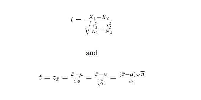
While these steps[1] are all important, they are also only a theoretical exercise since, in most cases, we have no perfect model. Instead, we usually have two samples which we want to compare. The upshot of this is, of course, that we have no way of knowing or . What we do know, however, is that we can calculate the standard error . Remember that in the last chapter we defined as follows:

Because we usually know the standard deviation s and the sample size n, we can estimate the standard error. Or rather, instead of calculating the standard error, we substitute  with the definition on the right-hand side of the equation. Substituting the estimate for the standard error into the definition of
  , we arrive at this formulation:

This z-score is also known as the t-distribution, which is closely related to the normal distribution.
T-distribution and normal distribution
https://uzh.mediaspace.cast.switch.ch/media/0_woyxdh6h
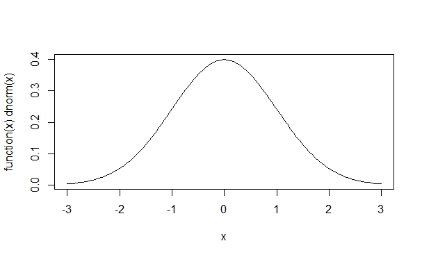
The t-distribution is closely related to the normal distribution, as you can see below.
What becomes visible when you juxtapose these two curves is that the peak of the t-distribution is a little lower than that of the normal distribution, while at the same time the tails on either side are bit fatter. We discuss why this is below, but first we’ll show you how to plot these two distributions in R. The command we need for this is called plot():
> plot(function(x)dnorm(x), -3, 3, col=1)With this command, we plot a normal distribution between -3 and 3, obviously with the  . The color parameter 1 corresponds to black.
Now we can add a red t-distribution to the graph with the following command:
> plot(function(x)dt(x,1,0), -3, 3, add=T, col=2)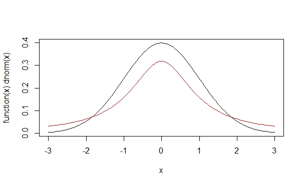
The logical parameter add is set to be TRUE, and accordingly this red new curve is added to the previous figure. The second argument in dt(), set to one here, corresponds to the degrees of freedom (more on which later). See what happens when we increase the degrees of freedom, adding the green and blue curves, respectively:
> plot(function(x)dt(x,10,0), -3,3, add=T, col=3)
> plot(function(x)dt(x,50,0), -3,3, add=T, col=4) 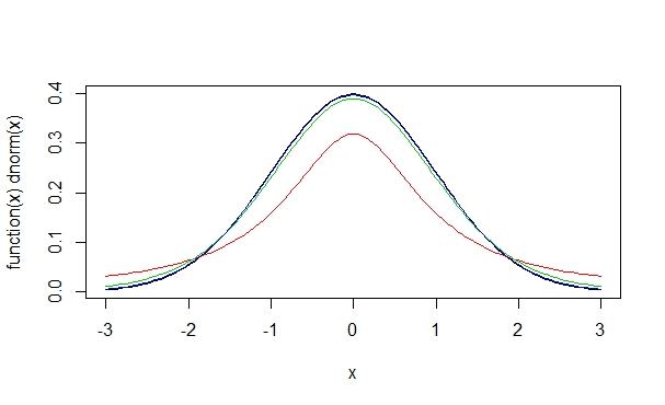
We see here that the more degrees of freedom we have, the more the t-distribution comes to resemble the normal distribution. The degrees of freedom are determined by the sample size: the more observations we have, the smaller the difference between the sample and the model gets. Indeed, if we have a t-distributions with many degrees of freedom, many starting at around 50, the t-distribution is virtually indistinguishable from a normal distribution with the same mean and standard deviation.
So why do we need both the normal and the t-distribution? This becomes clear when you recall how probabilities relate to the normal distribution. In the normal distribution, we know that 68% of all values range around the mean ± 1 one standard deviation and that 95% of all values lie in a range of the mean ± 2 standard deviations. We saw above that a t-distribution with one degree of freedom looks like a squashed normal distribution. This means that we have different probabilities for values to fall into a certain range. We saw that the t-distribution has a lower peak and fatter tails than the normal distribution. As a consequence, with the t-distribution we expect a higher probability for an individual observation to fall outside of the mean ± 2 standard deviations range.
The reason we need the t-distribution is that it accounts for the fact that we are working with sample data which may deviate from the model. One could say that the t-distribution is a more careful version of the normal distribution. With the degrees of freedom parameter, the t-distribuion errs on the side of caution when we expect large differences between the sample and the model, i.e. when we are working with small samples.
The concept of the degrees of freedom is technically quite advanced and complex to understand. For our purposes, it suffices to understand Baayen’s (2008) gloss of the concept: “Informally, degrees of freedom can be understood as a measure of how much precision an estimate has” (63). The more observations we have in our sample, the more degrees of freedom we have and the more the t-distribution looks like a normal distribution.
So, here we are: If two largish, normally distributed samples have  , they can be said to be ‘really’ different.
From the t-distribution to the t-test
In order to understand the essence of the t-test, you need to understand a couple of points. The standard error is an intrinsic characteristic of all data, and it refers to the fact that every sample deviates from its population. Indeed, samples deviate from the population mean the same way observations deviate from the sample mean, but to a lesser degree. In particular, in a normal distribution:
- 68% of all tokens deviate by max. ±1 standard deviation, and 95% of the tokens deviate by ±2 standard deviations
- 68% of all samples deviate by max. ±1 standard error, and 95% of the tokens deviate by ±2 standard errors
Therefore, if a sample deviates by more than ±2 standard errors, chances that it is really different are above 95%.
As we saw above, the t-distribution is simply a conservative, i.e. more careful, version of the normal distribution. In being more conservative, it accounts for the fact that we are working with sample data, rather than an infinite population or a perfect model. Mathematically, the t-distribution is more conservative than the normal distribution because we account for the standard error. Because significance tests are almost always performed on sample data and not on a population or a model, we work with the t-distribution rather than the normal distribution.
Since the t-test is quite simple to understand in practice, we discuss it while we demonstrate how it works in R.
The t-test on generated data
https://uzh.mediaspace.cast.switch.ch/media/0_e9hw0rue
iframe width=”640″ height=”360″ src=”https://tube.switch.ch/embed/e197a3ca” frameborder=”0″ webkitallowfullscreen mozallowfullscreen allowfullscreen]
There is a predefined function in R for the t-test, helpfully called t.test(). Let’s start by taking a look at the help file:
> ?t.testFrom the help file, we know that we can use the t.test() function to perform “one and two sample t-tests on vectors of data”. At the moment, the important information for us is that the t.test is to be performed on vectors. There is, of course, a lot of other information in the documentation, but there is nothing to worry about if you only understand a small part. What we discuss in this chapter should be sufficient to perform t-tests, and by the time you need more detailed measures, you will probably have surpassed the introductory level.
Now, let’s try the t-test out on some fake data. To do that, we create two objects containing random normal distributions with the same parameters:
> x = rnorm(100,5,2)
> y = rnorm(100,5,2)
Both objects, x and y, contain 100 observations of normally distributed data with a mean of 5 and a standard deviation of 2. Since R generates a random set of values, albeit with the same distribution, x and y are not identical, which we can see by looking at the two objects:
> x ; yWe refrained from printing the output here, since this list of numbers is not really interpretable to the human brain. Just note that there is a decent amount of variation in these randomly generated, normally distributed datasets. Now we want to apply the t-test to x and y:
> t.test(x,y)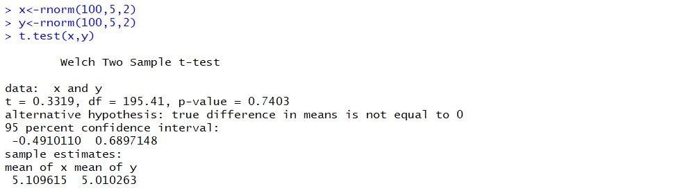
In the output, what interests us is the p-value. In the image above, we have a p-value of 0.74 which can be interpreted as a probability of 74% that the true difference between the mean of x and the mean of y is 0. In other words, we have a probability of 74% that the differences we observe are due to chance. Of course, the result of the t-test depends on the random data R generated for you, so you will see different numbers. In the video tutorial, we get p-values of 0.111, 0.146 and 0.125, all of which are surprisingly low. Surprising, that is, because we know with 100% certainty that both of our samples have the same parameters.
Most of the time, we are interested in finding low p-values because we usually want to show that the observed difference between two samples is due to a real difference, rather than due to chance. In those cases, even our “low” p-values like 0.111 are too high, since they admit for a probability higher than 10% that the differences we observe are due to chance. To provoke a lower p-value, let us generate a new sample with different parameters:
> y=rnorm(100,4,2) Now we can run a t-test on the new y and the old x to compare two samples with different properties:
> t.test(x,y)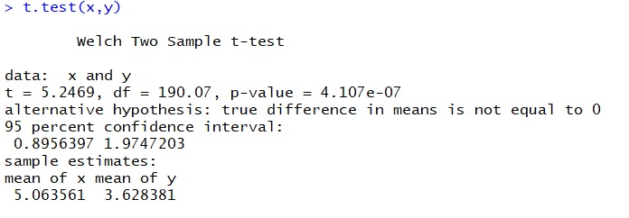
Most likely, the p-value you see in the output will be very small. In the image above we get a p-value of 4.107*10-7 In the video, we get a p-value of 7.685*10-6. This means that the probability that differences between x and y are due to chance is almost zero. When you run the t-test, you will get a slightly different value to these, but most likely it will also be a value very close to zero.
In the line below the p-value in the R output, we see the sentence “alternative hypothesis: true difference in means is not equal to 0”. This line has to do with the way statistical testing has developed conceptually: when we are performing significance tests, we are testing something we refer to as the null hypothesis. Usually, the null hypothesis (H0) is something along the lines of:
Yet, usually, we are interested in finding true differences that are not equal to zero. On the basis of H0, we can formulate an alternative hypothesis (HA) more consistent with this interest:
What you need to wrap your head around is that statistical significance testing does not allow us accept a hypothesis, we can only reject a hypothesis. This means that if we want to make a claim about a true difference between two samples, we need to reject the H0, which states that there is no difference between the two means. And the way to reject the H0 is to show that the means we observe are unlikely to have arisen by chance. This is the information contained in the p-value. The p-value tells us what the likelihood is of observing the means that we have under the assumption that the null hypothesis is true. If we see that there is only, say, a likelihood of 3% that the differences we observe are the product of chance, we can reject the null hypothesis, toss away the idea that there is no difference between our samples, and continue working with the alternative hypothesis.
In the example with the really different x and y variables, we got a p-value of 4.107*10-7. This means that the chance that we would observe the same results if there were difference between the two variables is smaller than 0.1% by many orders of magnitudes. In other words, we could draw a thousand samples from these two infinite populations, one with a mean of 4 and the other with a mean of 5, and never get a p-value high enough to not reject the H0.
So you would probably expect that these two samples, so significantly different from each other, would look very different. Let’s plot them and find out. We have already discussed distribution graphs at some length, so we can jump right into it. First, we can plot x as a histogram:
> hist(x,breaks=10,xlim=c(0,10),col=7)Then we can add y to the same graph. To render this histogram of y transparent, we use this odd color code:
> hist(y,breaks=10,xlim=c(0,10),add=T,col="#0000ff66")Although the histogram makes a difference between x and y visible, it is extremely hard for humans to judge whether it is significant or not. This is exactly why we need significance tests like the t-test.
The T-test on real data: the distribution of modals in six varieties of English
Let us look at an application of the t-test with real data. In this section we will not only apply the t-test, but discuss its properties, requirements and limitations.
https://uzh.mediaspace.cast.switch.ch/media/0_pdlqv3d8
Let us begin with an example adapted from Nelson (2003: 29). Suppose you want to study the distribution of modal verbs in different varieties of English. Take a look at table 5.1 below. It contains the five most frequent modal verbs in six varieties of English (British, New Zealand, East African, Indian, Jamaican and Hong Kong English, to be precise). The numbers are given as normalized frequencies per 1,000 words.
| BE | NZE | EAfrE | IndE | JamE | HKE | mean | standard deviation | |
| must | 0.5 | 0.57 | 0.81 | 0.69 | 0.51 | 0.36 | 0.57 | 0.16 |
| should | 0.93 | 0.94 | 1.71 | 1.22 | 1.05 | 1.82 | … | 0.39 |
| ought to | 0.1 | 0.01 | 0.04 | 0.06 | 0.15 | 0.1 | … | 0.18 |
| need to | 0.27 | 0.34 | 0.32 | 0.02 | 0.83 | 0.33 | … | 0.26 |
| have (got) to | 1.65 | 1.85 | 1.39 | 1.35 | 1.56 | 2.36 | … | 0.37 |
Few authors publish their entire data, which can make research difficult sometimes. For this exercise, we have partly reconstructed the data from the International Corpus of English (Greenbaum 1996). The International Corpus of English, or ICE as it is also known, is a collection of corpora of national or regional varieties of English with a common corpus design and a common scheme for grammatical annotation. Each ICE corpus consists of one million words of spoken and written English produced after 1989, and comprises 500 texts (300 spoken and 200 written) of approximately 2,000 words each. Download the two files containing the frequency of modals (automatically _MD-tagged tokens, since you ask how we got these numbers) per document in the ICE India and the ICE GB corpora:
modals_iceindia.txt and modals_icegb.txt
Load the files into R:
> indiamod <- scan(file.choose(),sep="\r")  ## select modals_iceindia.txt
Read 97 items
> gbmod <- scan(file.choose(),sep="\r")     ## select modals_icegb.txt
Read 97 items
And then run a t-test:
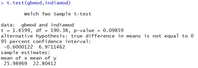
The p-value here is 0.099, which means that there is a probability of almost 10% that the difference we observe between the use of modals in Indian and British English is due to chance. You could, perhaps, choose a confidence value of 10% and argue that the difference between the two samples is, in fact, significant. You could do this because there is no universal rule which tells us which significance level to choose. In this absence of rules, there are only conventions. In linguistics, a 5% confidence value is the norm.[2] The confidence value is the p-value at which you are comfortable rejecting the H0. So, we have to conclude that the differences between the use of modal verbs in the Indian and British ICE are not statistically significant.
Again, let’s take a look at the data:
> hist(gbmod)
> hist(indiamod)
What we see are two histograms which are fairly typical of real outcomes of normal distributions. The Indian data is perhaps somewhat skewed to the right, but a slightly skewed normal distribution still counts as a normal distribution.
Let’s zoom in on one specific modal: should. Download the two files containing the counts of should (should_MD tokens) per article in ICE India and ICE GB:
should_iceindia.txt and should_icegb.txt
Load them into R and run a t-test:
> indiashould <- scan(file.choose(),sep="\r") ## select should_iceindia.txt
Read 97 items
> gbshould <- scan(file.choose(),sep="\r")    ## select should_iceindia.txt
Read 97 items
This time we get a p-value of 0.044. If we go with the conventional 5% significance value, we could say that there is a significant difference between the frequency of should in the Indian and British varieties of English.
However, if we plot the data, we might have second thoughts about making that claim:
> hist(gbshould)
> hist(indiashould)
These two histograms do not look like normal distributions. Not even like skewed normal distributions which grow strongly on one side and have a long tail on the other. Instead, what we get are many cases where there is no, or perhaps a single, should, and then some documents in which there are surprisingly many shoulds (the maximum number of shoulds lies at 15 and 23, for British and Indian English, respectively).
This means that one of the assumptions of the t-test, which assumes that the data is normally distributed, is violated. Thus, although we have what looks like a significant difference, we have to be extremely careful with how we interpret the results.
We are in a situation here where we hoped for clarity, but just raised new questions. There is good reason to think that this is not as depressing as it may seem. Without statistical tests, there would be no room for nuance. Things would be either blindingly obvious or impossible to distinguish. With the t-test, however, we have a basis for making the claim that the difference in the use of should in Indian and British English is most likely significant, as long as we are transparent about the significance level and our doubts regarding the distribution of the data. Moreover, we know that this is a marginal case and that it might be worthwhile to investigate the question further. Thus, the t-test, and statistical significance testing in general, can be useful even when the results do not offer any obvious conclusions.
Exercises
We gave a mathematical definition of the t-distribution early in the chapter without mentioning the fact that there are more ways of defining it. Try explaining the difference between these two definitions:
The t-test beyond R
We now understand the big picture, painted with a big brush. We can now successively turn to some of the gory details.
Everything we did, concerning the t-test, we did in R. But if you look at the definition of the t-distribution in the exercise above, you see that it is possible to calculate the t-test manually given that you know the mean, the standard deviation and the sample size for two samples. So far, we focused strongly on the p-value, and completely neglected the t-value, which is also always included in the R output of the t-test. When we compared should in Indian and British English, our output included a value of t = 2.0276. This is also the result you get if you enter the means, standard deviations and sample size into the the formula for Welch’s two-sample t-test:

When not working with a software like R, we could calculate the t-test manually, and would then have to look up the t-score for our specific degrees of freedom and the significance levels. These are found online, and most statistics books include one in the appendix. It’s great to know that software does all of this for us, but it is really helpful to understand what the software is actually doing, and knowing that you could do it yourself.
If you continue using significance tests, or also just read quantitative research, you will become familiar with different versions of the t-test. Some of the most frequent ones are the one- and two-tailed tests, which are sometimes called one- and two-sided tests. Woods, Fletcher and Hughes state that the two-tailed test “is so called because values sufficiently out in either tail of the histogram of the test statistic will be taken as support for H1. … one-tailed test, by contrast, is so called because values sufficiently far out only in one tail … will be taken as support for H1” (122). In our should example above, we had the null hypothesis that the two variants of English use should with the same frequency, in the hopes of rejecting it in favor of the alternative hypothesis (that there is a significant difference between the frequency with which the two variants use should). Because we were agnostic about which variant uses should more frequently, we used a two-sided test. If, however, we had the conviction that should occurs more frequently in Indian English than in British English, we could have conducted a one-sided test to identify whether IE should > BE should. For our purpose, the two-sided test often suffices, but if you are interested in reading up on the difference between one- and two-tailed t-tests we recommend reading Woods, Fletcher and Hughes (1986), pages 122 to 126.
We will discuss more applications of the t-test in later chapters, but you should now have a solid understanding of what we are doing when we are using the t-test. In the next chapter we discuss the chi-square test, which we can use on data which is not normally distributed.
References:
Greenbaum, Sidney. (ed.) 1996. Comparing English Worldwide: The International Corpus of English. Oxford: Oxford University Press.
Nelson, Gerald. 2003. “Modals of Obligation and Necessity in Varieties of English”. In Pam Peters, editor, From Local to Global English. Dictionary Research Centre, MacquarieUniversity, Sydney, pages 25–32.
Qu, Hui Qi, Matthew Tien and Constantin Polychronakos. 2012. “Statistical significance in genetic association studies”. Clin Invest Med, 33 (5): 266 – 270.
Woods, Anthony, Paul Fletcher and Arthur Hughes. 1986. Statistics in Language Studies. Cambridge: CUP.
- For a more detailed explanation of this, see chapters 6 and 7 in Woods, Fletcher and Hughes ↵
- The confidence values depend heavily on the discipline. In linguistics 95% is a common cutoff point, which means that we are happy if we can establish that there is only a 5% (p-value = 0.05) chance that the differences we observe are random. In contrast, for genome-wide association studies in biology there is evidence to suggest that significance levels should be as high as 99.99999821%, which means that you should aim for a confidence value of 0.00000179% (1.79*10-7) (Qu et al.). ↵
