In this part, Inferential Statistics, we discuss how we can move from describing data to making plausible inferences from it. To this end we introduce the concept of the standard error and discuss two common significance tests. In this chapter, we discuss the normal distribution and the standard error, which will provide the basis for the significance tests in the next two chapters.
Inferential Statistics
https://uzh.mediaspace.cast.switch.ch/media/0_0ugrgjn8
Think, for a moment, about variationist linguistics, where we often want to show that two speaker groups, two genres, two dialects and so on differ in their usage of certain features. In the last chapter we discussed some measures which provide a solid basis for statistically describing data. However, when we want to isolate which features are actually used differently in different variatieties of English, mere description is no longer sufficient since differences we observe could be due to chance.
In the last chapter we saw that we can determine whether an individual observation is statistically abnormal or not. With normally distributed data, we know what the chances are that a particular value deviates by so and so much from the mean. We saw in figure 3.4 that if we add a new observation from the same population to our sample, we can expect it to fall into the mean ± 1 standard deviation interval with a likelihood of about 68%. The likelihood that the new observation deviates from the mean by maximally ± 2 standard deviations is about 95%. If we add a new data point, and our new addition is a value lying outside this range, we could say that it is statistically quite unexpected, or, in colloquial terms, “abnormal”.
Inferential statistics take us to another level. In inferential statistics we do not want to describe the relationship of individual observations to a dataset. Indeed, normally we don’t have a single observation about which we want to find out whether it is really unusual. Instead, we usually want to compare two samples from two different populations or compare one sample to a linguistic model. In other words, we want to know what we can infer about whole populations from one or two samples. And so the question we are dealing with in inferential statistics is: when can we infer that a difference is “real”, which is to say statistically significant?
What is the normal distribution?
https://uzh.mediaspace.cast.switch.ch/media/0_z8gxjj8p
Remember that we only need two measures to describe normally distributed data: the mean and the standard deviation. The mean defines where the center of the distribution is, and the standard deviation measures the dispersion of the data. If you are not yet clear on how this works, you may want to revisit the last chapter.
How does this normal distribution arise? It is best to consider this through some experiments. For these experiments, let’s toss coins. The coin toss offers the easiest random outcome that you can imagine: we either get a head or we get a tail. If we toss a fair coin, what are the chances?
Of course, the chance that we get a head is 50% and the chance that we get a tail is 50%. The conventional notation for probabilities states the outcome of interest in brackets and gives the probability as a fraction. So if we toss a coin once, we get the following probabilities:
 and
and 
How do the probabilities change if we toss the coin twice?
 , so there is a 25% chance of getting 2 heads.
 , here, there is also a 25% chance of getting 2 tails.
 , again, there is a 25% chance of getting 1 head and 1 tail.
 , so too there is a 25% chance of getting 1 tail and 1 head here.
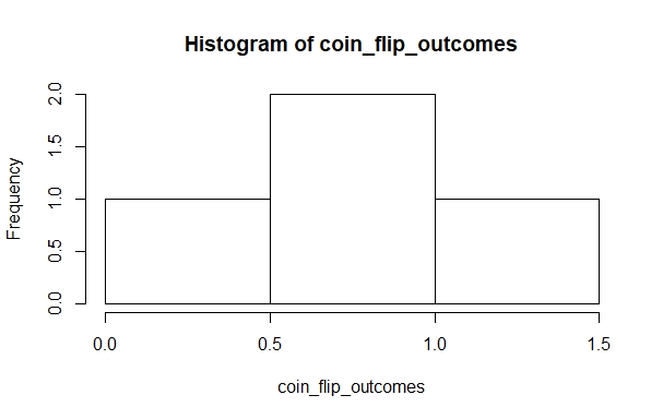
Since we are interested only in the number of occurrences and not in the sequence, the order is irrelevant. Accordingly, we can reformulate the last two probabilities into a single one:

Now we have two outcomes that occur with a likelihood of 25% and one outcome with a 50% likelihood of occurring. Again we can reformulate the probabilities of two coin flips, and state the probable outcomes:


We can represent these outcome probabilities in a simple histogram:
Flipping coins in R
https://uzh.mediaspace.cast.switch.ch/media/0_eddjipfw
If we toss the coin ten times, how many heads and tails will we get?
On average, we will get five of each, but the real outcomes vary a lot. Since it becomes tedious to flip coins so many times, let us use R to do the work.[1] We can use the rbinom() function to do this:
> rbinom(1,1,0.5)
[1] 1
rbinom() is a predefined function which generates a random binomial distribution. The name of the binomial distribution derives from the fact that there are only two possible outcomes. The probabilities of these two outcomes add up to one. It is one of the simplest statistical outcomes we can think of, and accordingly it is very easy to model.
Let’s look at the three arguments. The last one is set to 0.5. This is the probability for the outcome. Since we are assuming that our coin is fair, we want a 50% chance of getting a head and a 50% chance of getting a tail.
By changing the first argument, we can tell R to flip a single coin several, let’s say 10, times:
> rbinom(10,1,0.5)
 [1] 0 0 1 1 0 1 1 0 0 0
The second argument allows us to toss multiple coins. Consider the following command:
> rbinom(1,10,0.5)
[1] 9
We can think of this result as 9 of the 10 coins showing a head and one coin showing a tail. Of course, we can adjust the first and the second argument:
> rbinom(10,10,0.5)
 [1] 2 5 4 9 5 6 5 4 5 5
Now, on the basis of the second argument, R tosses 10 coins and sums the outcome, and on the basis of the first argument, R repeats this experiment 10 times. Since the list of numbers R generates as output of this command is not very intuitive to interpret, we should also visualize the results in a histogram. We can do this with a familiar sequence of commands:
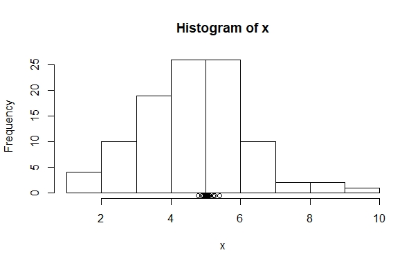
> x = rbinom(10,10,0.5); x; hist(x)
 [1] 7 6 4 3 6 7 8 6 3 5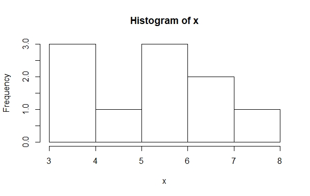
If you run this sequence of commands several times, you may notice that the histograms fail to resemble a normal distribution most of the time. It might be necessary to run the experiment more often. To do this, we can adjust the first argument:
> x = rbinom(100,10,0.5); x; hist(x)
> x = rbinom(1000,10,0.5); x; hist(x)
> x = rbinom(10000,10,0.5); x; hist(x)
In the slideshow of the histograms to these lines of code, we can see that the histogram looks more and more like a normal distribution, the more often you run the experiment:
The following example from Johnson (2008: 11) shows that if we process these histograms a bit further, we can really come to see the normal distribution. First, let’s assign a random normal distribution with 10,000 observations, a mean of 5 and a standard deviation of 2 to the variable x:
> x=rnorm(10000,5,2)The reason we don’t do this with the rbinom() function from above is that there we only get natural numbers between 0 and 10 as possible outcomes, which makes it much harder to illustrate the principle. However, with the rnorm() we get all possible numbers between 0 and 10. To see why this matters, create a histogram with 100 intervals and a range from 0 to 10 on the x-axis.
We can use the hist() with additional arguments to do this. For the 100 intervals, we add an argument breaks=100 and for the range we can set xlim=c(0,10) Additionally, we set a logical arugment freq=F. This plots the histogram as a density function, which means that the total area taken up by the histogram is one. And over this histogram we lay the curve of a normal distribution, dnorm():
> hist(x,breaks=100,freq=F,xlim=c(0,10))
> plot(function(x)dnorm(x,mean=5,sd=2),0,10,add=T)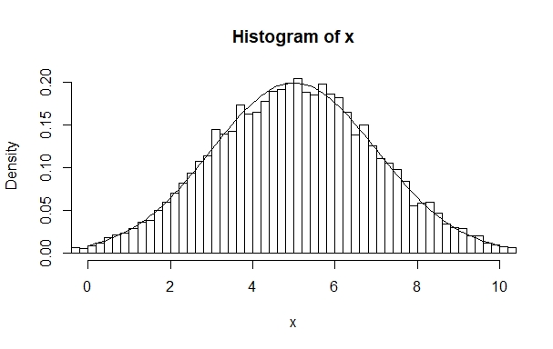
Now we see how we get a normal distribution if we use a binomial approach to generate enough observations.
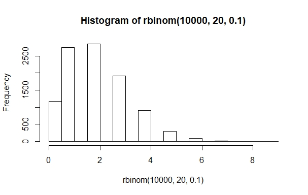
So far, we have only looked at symmetrical normal distributions with equal probabilities for both potential outcomes. However, many normal distributions are skewed, meaning that one of the outcomes has a higher likelihood of occuring. We can easily model this by changing the probability in the rbinom() function:
Let’s take stock of what we just did. We used a lot of histograms to visualize the results of our simulated coin tosses. Remember that the histogram counts how often each value (or a range of values) occurs, plotting the frequency on the x-axis and the scale of the variable on the y-axis. For our symmetric binomial distributions, with equal probabilities for both outcomes, the outcomes are clustered around 5, which is the mean, the median and the mode of our outcomes. This means that, in general, we have a much higher likelihood of counting five heads and five tails than seeing 9 heads and 1 tail if we flip a coin ten times. We simulated coin toss sequences with 100 to 10,000 observations and saw how higher sample size led to better approximations of the normal distribution. In figure 4.3, we lay a curve over a histogram of a normal distribution. The resulting curve looked a lot like figure 3.4 from last chapter, which we show here again as figure 4.5:
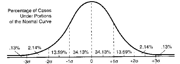
We show this figure again because it perfectly illustrates the importance of the normal distribution: we can use it as a model against which to compare the probability of seeing an observation, given that we know the mean and the standard deviation of the data. Before we proceed on our journey towards significance testing, we briefly want to introduce some other distributions.
Other distributions
https://uzh.mediaspace.cast.switch.ch/media/0_sol9aolk
As you know, normal distributions are fully defined by the mean and the standard deviation. For the t-test, which we will discuss in the next chapter, we need the mean and the standard deviation, as well as a measure for how reliable our sample is. If our samples are normally distributed, the only factor that restricts reliability is the size of our sample: as we have seen, with small samples, real outcomes vary a lot. The smaller the sample is, the more chance variation we expect. We discuss this chance variation, which is called the standard error, below.
If we have distributions that are not normal, different test for statistical significance are needed. They also exist, and we introduce one of them later on, in the chapter on the Chi-Square Test.
To get a feeling for how else data can be distributed, take a look at the four decisively un-normal distributions below:
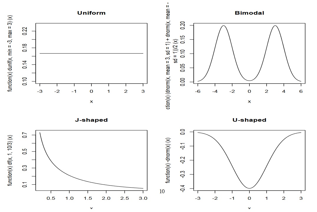
Now take a moment to think about how you expect the distribution of these measures to look. When you use the distributions above as inspiration, focus on their shapes, not their absolute values.
How normal is linguistics? How normally is the data distributed?
There is some dispute about how realistic the assumption of normal distribution is in linguistics. Taking a positive stance, Johnson claims that “the data we deal with [in linguistics] often falls in an approximately normal distribution” (16). Conversely, Oakes says that “in corpus analysis, much of the data is skewed” which is why for instance Chomsky criticized the corpus linguistics approach (1998: 4).
For our purposes it suffices to know that “skewness can be overcome using lognormal distributions” (Oakes 4), which means that rather than working with raw data we take the logarithms of our observations which often results in a normal distribution. Perhaps more intuitively, the central limit theorem gives us a good basis to assume a normal distribution. Oakes (1998) describes the central limit theorem as follows: “when samples are repeatedly drawn from a population the means of the sample will be normally distributed around the population mean … [no matter] whether or not the distribution of the data in the population is itself normal” (5f). In other words, the process of repeatedly drawing samples generates a new, normally distributed set of data centered around the mean found in the underlying population. This is precisely what we did above when we simulated 10’000 times 10 coin flips with R (although in this example the underlying distribution is also normal).
Standard Error
https://uzh.mediaspace.cast.switch.ch/media/0_b1icas1e
As mentioned already, we need one last measure for chance variation before we can proceed to the first significance test. This measure is the standard error.
We have seen above that we get closer to the normal distribution the bigger our sample is. But the truth of the matter is that even a million coin tosses will not get us a perfect normal distribution. As we saw in figure 4.3, there is always a gap between outcomes and model (even if the outcomes are generated from a normal distribution), between the sample and the (infinite) population, between “reality” and “fiction” (metaphorically speaking).
The gap between the observed data and the model is called the standard error,  , and fortunately it can be measured. Think again, briefly, about how the standard deviation works. We have seen that, on average, a single observation
 deviates from the mean of a sample
  by the standard deviation
  . The standard deviation expresses how much we can expect a token to deviate from the mean.
As the observation, so the sample: a sample deviates from the mean of the model, for instance an infinite population or a perfect normal distribution. The sample deviates from the model mean  by the standard deviation of its mean
  . We call this the standard error.
Now, the standard error expresses how much we can expect a sample to deviate from its perfect model. In other words, the standard error is a measure of how reliable our estimate, , of the model mean is. This is why we can say that the standard error does for the sample with respect to the model what the standard deviation does for the observation with respect to the sample.[2]
Mathematically, the standard error is defined as follows:

To put the math into words, the standard error is the square root of the sample variance divided by the number of observations. Since we know that the variance is the squared standard deviation, we can reformulate this and say that the standard error is equal to the standard deviation divided by the square root of the number of observations.
Imagine the simplest case: you have only one observation. In that case, you can calculate the standard deviation and you know that n is 1. Since the square root of 1 is 1, you know that the standard error is equal to the sample’s standard deviation.
If n equals 2, there is 50% chance that one observed value will be bigger than the model’s mean, while the other will be smaller. If that is the case, the deviations partly cancel each other out. If n=3 the chance that all observations are bigger or all are smaller than the model’s mean decreases further, so the mutual cancelling out of the deviations will become bigger and bigger when we increase n.
The standard error also makes sense intuitively: the more samples we have, the more observations we have. With more samples, the likelihood of our data representing the underlying population closely is higher. Accordingly, the standard error decreases by construction with more samples. This explains why the number of samples is in the denominator. Conversely, if the standard deviations in our samples are large, the likelihood that our sample represents the underlying population mean is lower. Therefore, the standard error increases as the standard deviations increase. This explains the count.
Visualizing the standard error in R
https://uzh.mediaspace.cast.switch.ch/media/0_cxvf9dlp
We can try to get an impression of the standard error in the following way. Use the following sequence of commands to generate a histogram of a binomial distribution:
> rbinom(100,10,0.5) -> x ; mean(x); hist(x)
[1] 5.12
This will look very familiar to you by now, so we didn’t include a figure of the histogram here. Now, let’s add a dot beneath the x-axis for the mean. To do this, we can use the points() function, which takes as arguments the value we want, in this case the mean of x, and it’s position in the graph, in this case slightly below the x-axis:
> rbinom(100,10,0.5) -> x ; mean(x); points(mean(x),-0.5)
[1] 5.11
Here it gets interesting: if you look at the space between the x-axis and the beginning of the histogram’s bars, you will see that a small dot appeared. This is the mean of the freshly generated random binomial data. If you run this line multiple times – retrieve it using the up-arrow and just enter it several times – you will see that the dots all center around the mean of 5, but only very rarely hit it precisely.
What becomes visible here is how the sample means deviate much less from the underlying model mean of 5 than do the individual values, which you can see in the bars of the histogram. You can think of the bars as small samples: they are the outcome of tossing a coin 10 times. In contrast, the dots represent large samples: as the mean they summarize the outcomes of 100 repetitions of 10 coin flips. This is where the sample size in the denominator of the standard error becomes visible: more observations lead to a better approximation of the model mean.
Implications for significance testing
https://uzh.mediaspace.cast.switch.ch/media/0_16xub2r3
Think back to the beginning of the chapter. We said there that if we have normally distributed data and want to compare an individual observation to its sample, we can not say that the observation is really unusual if it lies within ± 2 standard deviations from the mean. However, if it lies outside this range, being either higher than the mean + 2 standard deviations or smaller than the mean – 2 standard deviations, we only have a roughly 5% probability that this value deviates so much from the mean by chance.
Now, we have seen that samples deviate in exactly the same way as tokens, but to a much lesser degree. Sample means deviate from the model mean by the standard error, while individual observations deviate by the standard deviation. So, to find out whether a sample is really different from the model (or from a sample taken from a different population), we can use the same reasoning we used to find out whether an observation is really different from a sample
Taken at face value, this would mean that we have a 68% likelihood that a sample deviates from the model mean by ± 1 standard error and a 95% likelihood that the sample deviates by ± 2 standard errors. However, as you might have expected, there is a twist to this. And this precisely is what we are going to do with the t-test in the next chapter.
References:
Johnson, Keith. 2008. Quantitative Methods in Linguistics. Malden, MA: Blackwell.
Oakes, Michael P. 1998. Statistics for Corpus Linguistics. Edinburgh: EUP.
- Although, honestly, we should not complain about flipping a coin ten times, considering that two undergrads at Berkley undertook 40,000 coin tosses for an experiment (https://www.stat.berkeley.edu/~aldous/Real-World/coin_tosses.html). ↵
- You will recall that we used
 in the last chapter to denote the standard deviation in the unknown, infinite population. Here we similarly use to refer to a measure of the unknown population. ↵
