In this chapter, we discuss the basics of descriptive statistics and show you how to calculate the most common descriptive statistical measures in R.
Beginning statistics
https://uzh.mediaspace.cast.switch.ch/media/0_mlilvtqv
Where in programming the main way to make progress is trial and error, when it comes to learning statistics, we recommend reading different definitions of the main concepts until you understand them. In a first instance, we will provide the best explanations that we can come up with. If questions remain, or if you want to dive deeper into the topics, we can recommend starting with any of the following texts:
- Woods, Anthony, Paul Fletcher and Arthur Hughes. 1986. Statistics in Language Studies. Cambridge: CUP.
- Oakes, Michael P. 1998. Statistics for Corpus Linguistics. Edinburgh: EUP.
- Butler, Christopher. 1985. Statistics in Linguistics. Oxford: Blackwell.
Consider these three texts the tip of the iceberg: there are many introductions statistics, and if neither our book nor any of our recommendations manage to spark your understanding of statistical concepts, you are bound to find some other book which does.
Average: mean, median, mode
https://uzh.mediaspace.cast.switch.ch/media/0_9d625jz9
Let’s jump right in. Statistics, as we mentioned in the introduction, provides many different ways of describing and analysing numerical data. The easiest statistical measure is the average. The most complicated thing about the average is that there are three different measures that can correspond to what is colloquially referred to as the “average”.
The most common measure of the average is the mean. The mean of (1, 5, 6) is 4. It is calculated by summing all of the numbers you are interested in and dividing the resulting value through the amount of numbers. Mathematically, the mean  is formulated like this:

The sum operator,  , is a loop which runs through all observations,
  , and calculates the sum of all values. In our example, we have three observations:
  . If we sum these up, the result is 12. This value is then divided by the number of observations, in our case n=3. Thus, we arrive at a mean=4.
The median is the second measure which is sometime referred to as the average. The median is the value which lies in the middle of a sorted list of numbers. The median of (1,2, 6) is 2. For every list, 50% of the observations have values higher and 50% have values lower than the median. If a list has an even number of entries, the median is defined as the mean of the two numbers in the middle of the list.
The final measure for the average is the mode. The mode is the value which is most frequent in a list. The mode of (1,1,4,6) is 1. In distribution graphs, which we discuss further below, the mode is the peak.
Averages in R
We can easily calculate the three measures for the average, mean, median and mode, in R. To do this, let us assign create a vector x containing a list of numbers:
> x <- c(10.4, 5.6, 3.1, 6.4, 6.4, 21.7)
Once we have defined the variable x, we can use the predefined mean function in R:
> mean(x)
[1] 8.933333
The same is true for the median:
> median(x)
[1] 6.4
There is no direct way to calculate the mode, but that does not mean that it cannot be done. It just takes more steps do so. First, we need to create a table:
> table(x)
x
 3.1  5.6  6.4 10.4 21.7
   1    1    2    1    1
This command shows us which value occurs how often. With the function max(), we can calculate the maximum:
> max(table(x))
[1] 2
This means that the element which occurs most frequently occurs twice. Finally, we can use a closely related command, which.max(), to identify which value it is that occurs most:
> which.max(table(x))
6.4
  3
As we could already read from the table we created earlier, the mode is 6.4, which stands in the third column of the table. When working with a small set of observations, like we are here, it is possible to just use the table function and then look for the value which occurs most frequently. However, once you start working with thousands of observations, this is no longer possible, so it is worth knowing the steps required to calculating the mode.
Calculate the mean and the median in R without using the predefined functions mean() and median(). Try it out in R and compare your solution to the example solutions below.
Apart from the fact that we will need some of these measures for the average later on, they are useful in their own right. Most of the time when you are presenting any sort of quantitative finding, you will want to summarize your data effectively using these measures.[1]
Distribution graphs and normal distribution
https://uzh.mediaspace.cast.switch.ch/media/0_jb65iivi
We already mentioned distribution graphs above when discussing the mode. Distribution graphs are a very useful means of representing continuous numeric variables, such as:
- Marks of a class
- The weight of UK citizens (e.g. a sample of 1000 arbitrarily chosen people)
- Frequencies of “has” in the 44 texts of LOB Category A
- Word lengths (in letters) in 6 “London Gazettes” of 1691, as you see here:

So what do these distribution graphs visualize, and how can we make them? Using an example from Woods et al. (1986: 16ff.) we discuss here first the theory, then we put the theory into practice in R.
Let us begin by looking at the raw data:
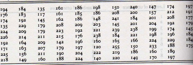
What you see in the table are exam scores of 108 Cambridge students from June 1980. There are 107 observations, and the data is unsorted. How do we proceed to create a distribution graph for this set of data?
In a first step, we have to sort the numbers, and, unless there is a really good argument for the opposite, we do this in ascending order. In a second, and more important step, we interval classes like these:
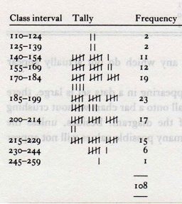
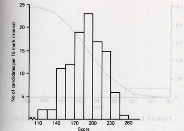
Each interval needs to contain the same difference between the upper and the lower bound. In the image above, we see that each interval has a length of 15 points. The first interval contains scores between 110 and 124, the second interval contains scores between 125 and 139, and so on. For each of the ten intervals, we count the frequencies. We can easily create a table with the frequencies, and present the information in the form of a distribution graph:
While it is possible to create distribution graphs like this in Excel, it requires either a fair amount manual work or the use of rather complex functions. In R, we can do this much more easily.
The scores are available for download as a raw text file here:
We discussed in the previous chapters how to open files in R. You will remember that you can open files using the file path:
> scores <- scan(file="/Users/gschneid/Lehre/Statistics/cambridge-scores.txt", sep="\n")or by opening a search window:
> scores <- scan(file=file.choose(), sep="\n")Once the data is assigned to the variable scores, we can easily create a histogram using the predefined hist() function:
> hist(scores)This should result in this histogram:
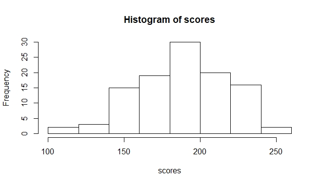
The chart we get here more or less resembles the normal distribution we see below. In many other cases, you will not get normally distributed data. Regardless of how confident you are in your intuition about the distribution of your data, it is usually worth plotting it in a histogram (or another distribution graph) to see how your data is distributed. This is especially important because many statistical methods are adapted to particular types of data distribution.
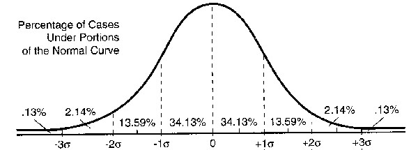
We discuss how the normal distribution arises in more detail in the next chapter, but we want to introduce one of it’s properties here already, since this property is the reason why the normal distribution is central to statistics. The property in question is the fact that we can always tell how many observation are in which range around the mean when data is normally distributed.
 and
and  , we get 68.26% of all observations. So, a good two-thirds of all values in a normal distribution only deviate from the mean by 1 standard deviation or less. We can also see that 95.44% of all values deviate by maximally 2 standard deviations from the mean. It is precisely this property of the normal distribution which we will leverage later for significance testing.
Dispersion: variance and standard deviation
https://uzh.mediaspace.cast.switch.ch/media/0_78sgckv6
We have seen that the averages – mean, median and mode – are very important for describing data. While all three measures can be very useful, they are not sufficient. If you think about the following question, you will get an inkling for why this is the case. Grab a pen and a sheet of paper and sketch the following scenario:
Imagine a city with an immense urban sprawl, where people commute 1.75 hours per day on average. Funnily enough, the average height of the male adult population is 1.75 meters. Say you want to plot these two measures, the duration of the commute and the height of the adult population, on a scale of 0 to 3. How do the two distribution graphs differ?
In these bare-bones distribution graphs you see how starkly different normal distributions can look. Note in particular how commutes can run the gamut between a couple of minutes and more than two hours, while the height of adults hardly ever goes below 1.4m and doesn’t substantially go over 2m.
So, even if we were working with two samples that have a similar mean, median or mode, we have no way yet of comparing how the data is distributed across its range. This means that comparing average values is at best a hint at statistical peculiarities, but no reliable tool or even a “proof” of any theory. Butler says it all when he cautions: “If we have demonstrated a difference in, say, the means or medians for two sets of data, can we not just say that one is indeed greater than the other, and leave it at that? This would, in fact, be most unwise, and would show a lack of understanding of the nature of statistical inference” (1985: 68-9). If you have calculated the averages for two data sets you want to compare, you will need further measures to begin making any substantive claims about their differences. This is where dispersion comes in.
Dispersion refers to how far the individual data points are spread. The obvious and simplest candidate measure for identifying dispersion is the range. The range effectively refers to the highest and the lowest observations you have in your data, so all you have to establish the range is look for the maximum and minimum in the data. There are some simple functions for this in R:
> max(scores)
[1] 255
> min(scores)
[1] 117
> range(scores)
[1] 117 255
You can also calculate the ratio between the two points:
> min(scores) / max(scores)
[1] 0.4588235
This ratio tells us that the lowest score is only 46% of the highest score.
While there is some information to be gleaned from the range, it is a rather bad measure of dispersion for two reasons. Firstly, it is extremely susceptible to outliers. A measuring mistakes, or one student handing in the empty sheet can distort what little information the range gives us. Secondly, the bigger the sample, the less reliable the range is. This is because the likelihood of having an outlier increases with the sample size. To avoid these problems, we need a measure of dispersion which takes all scores into account.
A first idea would be to calculate the sum of the differences from the mean for each observation. However, by the construction of the mean, these differences cancel each other out. The sum of all negative differences, i.e. the differences calculated from those values which are smaller than the mean, is exactly equivalent to the sum of all positive differences, i.e. those calculated from values larger than the mean.[3]
The better idea is to work with the sum of squared differences between each observation and the mean. Squaring renders each difference a positive value. Moreover, strong deviations are weighted more heavily. The sum of squared differences, divided by the number of observations (minus one) is what we call the variance:

This formula defines the variance as the sum of the squared difference between each observation, from  to
to  , and the mean. This sum is divided by the number of observations, n, minus one. We take n minus one rather than n because it has shown to work slightly better.[4]
It is common to use the standard deviation s instead of the variance s2. The standard deviation is defined as the square root of the variance:

The standard deviation tells us how much any observation deviates on average. In other words, the standard deviation shows how much we can expect an observation to deviate. Imagine for instance that we can add an additional observation to our sample. We can expect this additional observation to deviate from the mean by the standard deviation.
In a perfect normal distribution, which we saw in figure 3.4, we get the following behavior: 68% of all sample values lie within  , which is to say within the mean plus or minus one standard deviation, and 95% of all values lie within the range of
  .
.
A brief comment on notation. In the preceding paragraph, we used s as a shorthand for the standard deviation of the data. This is how you will often see the standard deviation notated because we generally work with data samples taken from larger populations. In this chapter we already saw a histogram of the word lengths in six issues of the London Gazette in 1691. However, the Gazette has continuously been published since 1665, the current issue at the time of writing being number 62,760. The six issues we looked at are a vanishingly small sample from a much larger corpus. If we were to analyze word lengths in these six issues, we would denote the standard deviation with s. However, if we were to analyze word lengths in all issues of the Gazette, which is to say the whole “population”, and calculate its standard deviation, we would use the Greek letter sigma:  . So the conventional notations are:
s = standard deviation of sample
= standard deviation of population
Most of the time, you will not be able to access the data of a full population, and so you will get used to seeing the standard deviation notated as s.
Z-Score and variation coefficient
https://uzh.mediaspace.cast.switch.ch/media/0_xsr6mqeq
A value closely related to the standard deviation is the z-score. Say you want to find out how much a particular value deviates from the mean . While you could simply subtract the mean from the value you are interested in, the deviation of individual observations from the mean usually calculated in relation to the standard deviation:

This is known as the z-score. The z-score expresses by how many standard deviations an individual value deviates from the mean. As such, it is a normalization, abstracting away from the actual mean and value, allowing us to compare values from different (normally distributed) data.
Fret not if you did not get the third question right: we discuss this again in the next chapter. It is possible to solve, though, with the help of figure 3.4, where we saw which percentage of observations deviates from the mean by how much. Knowing this can help us to evaluate whether an observation is expected or not. If we know that the scores are normally distributed, we know that 68% lie within  . Since the mean is 10 and the standard deviation is 1.5, we know that it’s rather unlikely that a student will have a score higher than 13 and lower than 7, since 95% of all scores are within this range. However, in a class of 20 students, one will probably be outside of this range. In other words, the score of one student is likely to have a z-score higher than 2.
Another useful measure is the variation coefficient. The variation coefficient is an easy way to express the amount of dispersion of a distribution graph. You can calculate the variation coefficient by dividing the standard deviation s by the mean :

Thus, the variation coefficient is a ratio which expresses how many percent of the mean the standard deviation is. If you calculate the variation coefficient using the formula above, the result is a fraction. If you want to present the variation coefficient in terms of percentages, you can multiple the fraction by 100.
Variance in R
https://uzh.mediaspace.cast.switch.ch/media/0_nefan39o
Let’s see how we can calculate the variance in R. We begin again by assigning our data to a variable:
> x = scoresIn a first step we can just plot the raw data with the plot() function:
> plot(x)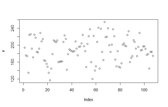
Since the resulting graph is not easily interpretable, we can use nested functions to sort the data:
> plot(sort(x))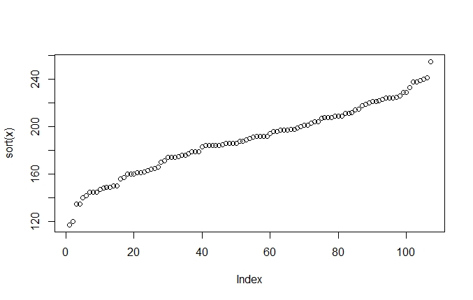
Once sorted, we can see a typical pattern. The curve first ascends steeply and levels out a bit in the middle before rising steeply again. This is typical of the normal distribution. As we saw, most of the values in normally distributed data cluster around the mean, which is what the more level, plateau-like values in the middle of the plot show. Further away from the mean there are fewer values, which means that the jumps between observations are relatively bigger. This is what you see in the steep increases on the other side of the mean.
Of course, we can now plot the scores in a histogram, just like we did above in figure 3.3:
> hist(x)We can now see how the levelling out of the scores in the middle of the sorted plot (figure 3.6) corresponds to the peak in the histogram. Think about what happens here. In the sorted scores plot, we really only have one dimension in our data, even though we represent it on two dimensions. The dimension we do have is the score itself, a value between 117 and 225. We generate the second dimension artificially by ranking each data point according to its value. In plots like figure 3.6, the value of the scores is represented on the y-axis and the index is represented on the x-axis.
In the histogram, we move the value of the scores to the x-axis and use the y-axis to count how often each value occurs. Typically, of course, histograms group the data into intervals. In figure 3.7, for instance, the data is divided into eight intervals. The extra steps of grouping into intervals and counting make the histogram much better suited to showing how the data is dispersed than a simple sorted plot. It is not for nothing that the histogram is called a distribution graph.
Of course, it is not enough to simply represent the dispersion visually: we also want to calculate it. We introduced the variance above as the sum of the squared differences between each observation and the mean of a dataset.
First, we show you how to calculate the variance in R from scratch. For that, the first step is to subtract the mean from all the values. Try this:
> (x - mean(x))Since R recognises x as a vector, it automatically performs the operation on every value in the vector. The output shows us the demeaned scores, which is to say the difference between each score and the mean.
If we, naively, implement the first idea we had for a measure of dispersion, we just calculate the sum of the demeaned values above, without squaring them:
> sum(x-mean(x))
[1] 1.307399e-12
As expected, the result is zero, or close enough to zero that the difference is negligible. It is not exactly zero because of a few rounding mistakes.
To calculate the actual variance, you can implement the formula we discussed above in R. Take a look again at the formula for the variance:
This translates into R as:
> sum((x - mean(x))^2) / (length(x)-1)
[1] 851.7515
In words, we calculate the sum of the squared differences – the ^ symbol is used for the mathematical power in R – and then divide the result by the number of observations minus one.
Alternatively, we can simply use the predefined function, var():
> var(x)
[1] 851.7515
Standard deviation, z-score and variation coefficient in R
https://uzh.mediaspace.cast.switch.ch/media/0_2rzq65p1
Now that we know how to calculate the variance, we can easily calculate the standard deviation by taking the square root:
> sqrt(var(x))
[1] 29.18478
Alternatively, we can use the predefined function to calculate the standard deviation:
> sd(x)
[1] 29.18478
Once we have the standard deviation, we can also calculate the z-score for individual observations. For instance, if we want to calculate the z-score for the first value, , we need to translate our formula for the z-score into R code. Remember that the z-score is the deviation of a given value from the mean divided by the standard deviation, which in R looks like this:
> ((x[1]-mean(x)) / sd(x))
[1] 0.1732435
In the first part of the command, we select the first value in the vector and subtract the mean from it. You can see here that values in vectors can be accessed in the same way as individual values in data frames. Unlike the data frame, the vector is a one-dimensional object, so we do not need to use the comma to specify the dimension. If we know the position of the value we are interested in, we can simply write that in the square brackets.
Combining the information on the probabilities in normal distribution from figure 3.4 with the z-score, we can see how many of the scores in
Finally, we can calculate the variation coefficient simply by using two predefined functions:
> sd(x)/mean(x)
[1] 0.1544627
The result is a small value here, so you can see that the standard deviation is only a small fraction of the mean. Or, to put it differently, the standard deviation is only about 15% of the mean, which shows us what we could already guess from the histogram: the data is concentrated fairly strongly around the mean, and accordingly there is little dispersion in our data.
Outlook: from description to inference
The measures we discuss in this chapter – the mean and the standard deviation – lie at the very heart of statistics, and will follow us throughout this book. Other measures, like the z-score, give us a sense for the relation between individual observations and the whole data sample. However, usually in linguistics we are not interested in the behavior of individual data points. Instead, we often want to compare language samples from different populations to figure out how these populations differ.
One way of doing this would be to compare the averages and standard deviations of two datasets, which already gives us a clearer picture of any differences between them. But still, because real data is often a far cry from a perfect normal distribution, the insights we get by merely looking at means and standard deviations are not reliable. We could imagine crude tests for normality, such as comparing the mean, median and mode of a dataset, since these three values align in normally distributed data.
So what we need is not only a reliable means of identifying the real differences between two datasets, but also a tool for evaluating data which is not normally distributed. And, since we are usually not interested in discussing differences between different datasets but differences between populations, we need to know when we can make inferences about a population from something we observe in a data sample. We discuss how to do all of this in the next part, Inferential Statistics.
References:
Butler, Christopher. 1985. Statistics in Linguistics. Oxford: Blackwell.
Lazaraton, Anne, Heidi Riggenbach and Anne Ediger. 1987. Forming a Discipline: Applied Linguists’ Literacy in Research Methodology and Statistics. TESOL Quarterly, 21.2, 263–77.
Oakes, Michael P. 1998. Statistics for Corpus Linguistics. Edinburgh: EUP.
Woods, Anthony, Paul Fletcher and Arthur Hughes. 1986. Statistics in Language Studies. Cambridge: CUP.
- One example for this, picked because it is too fitting, is in Lazerton et. al (1987): "Respondents were asked to estimate the number of statistics or research methods courses they had taken. The number of courses ranged from 0 to 12 with a mode of 1, a median of 1.66, and a mean of 2.27 (SD = 2.18)" (267): ↵
- We introduce the standard deviation in detail below. ↵
- For a longer discussion of this doomed approach, see page 41 in Woods et al. (1986). ↵
- If you are interested in reading more about this, look up “Bessel’s correction”. ↵
