In this part of the book, Advanced Methods, we discuss some more involved methods of statistical analysis and show some areas of applications. In this chapter we introduce the concept of regression analysis and show how regression can be used to work around the limitations of significance testing.
Introduction
https://uzh.mediaspace.cast.switch.ch/media/0_liw3nrru
One of the themes which has run through all our methodological discussions in this book are limitations. There is usually a limiting assumption or requirement which needs to be satisfied for a statistical procedure to work reliably. Take, for instance, the fundamental assumption of the t-test: the data needs to be normally distributed for the t-test to work. In reality, data is often not normally distributed, as we have seen for instance with should in the Indian and British ICE corpora and will see in other examples.
Let’s take a look at a further example. A lot of research has been conducted on the use of passive forms. Specifically, many people are interested in the question whether British or American English contains more passive forms. If we were to run a t-test on samples of American and British English, the outcome would indicate that British English contains more passive forms than American English. However, we can’t be sure whether this is reliable since the assumption for the t-test, normally distributed data, is not satisfied. We can clearly see this in figure 9.1 below.
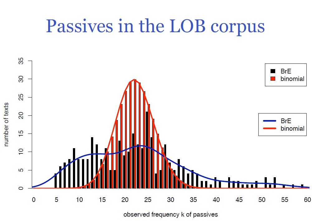
The graph from Evert (2009: 36) summarizes passive forms in the Lancaster-Oslo-Bergen corpus (LOB). Since in the LOB corpus every article is 2,000 words long, we could expect to see normally distributed data. At least, this is what we would expect to see if the independence assumption holds. Under this assumption, the passive forms should be homogenously distributed, meaning that the distance between passive forms is always more or less the same. This would entail a normal distribution of passive forms, and provides the counterfactual scenario which is modelled in red. The red curve is a normal distribution with a mean of 22. If the data we observe corresponded roughly to the red curve, we could compare the American data with the British data using a t-test.
Looking at the actual data, colored black, and the blue line which models the observed data, we can see that this is clearly not the case. Often, the reason for not finding a normal distribution where we would expect one is that we are missing an important factor. Remember, for instance, the exercise in Introduction to Inferential Statistics, where we asked you how the height of adults is distributed. There, we saw a bimodal distribution with two peaks: one for women and one for men. If we had separated the height data according to gender, we would have had two normal distributions with different means.
In the example at hand, the factor we are missing is genre. The LOB contains texts of 15 different genres, including different styles of journalism, different genres of fiction and scientific writing. You may have had occasion to notice yourself how passive forms are often used in scientific writing. In fact, passive forms are used substantially more in scientific writing than in most other genres. If we look at the right tail of the actual data, we see that some of these 2,000-word documents contain as many as 60 passive forms, while others contain only five. The spread is really large, and the genres account for the fact that the data is not normally distributed.[1] The reason why we don’t see something as distinct as a bimodal distribution here is because there are not only two distinct genres. Additionally, there are probably other factors which contribute to this distribution, but genre is clearly one of the main drivers here.
Consequently, if we want to analyze passives in British and American English seriously, we cannot simply look at the geographical dimension and run a t-test on whether the differences we see are significant. Similarly, we cannot run a chi-square test on this data since the chi-square assumes that two samples only differ on the one dimension which separates the data in the table. These significance tests, which serve us well under certain conditions, are useless here, since there are multiple factors which contribute to the distribution of the data. We need something that is capable of taking several factors into account, and this is precisely what regression analysis affords us.
Regression analysis in R
https://uzh.mediaspace.cast.switch.ch/media/0_9ia6awdw
Regression analysis is a very central element of statistics. The importance regression analysis to statistics, its underlying idea and its function is captured in the following quote from Kabacoff (2011):
“In many ways, regression analysis lives at the heart of statistics. It’s a broad term for a set of methodologies used to predict a response variable (also called a dependent, criterion, or outcome variable) from one or more predictor variables (also called independent or explanatory variables). In general, regression analysis can be used to identify the explanatory variables that are related to a response variable, to describe the form of relationship involved, and to provide an equation for predicting the response variable from the explanatory variables.” (Kabakoff 2011: 173)
What stands to note here is that regression is an umbrella term for a set of related but distinct methodologies to describe the relationship between different variables in a dataset. R alone contains more than 200 inbuilt regression functions, which differ not only in their precise (mathematical) definition, but also in their conceptual complexity. We are going to begin here by discussing linear regression, one of, if not the simplest implementation of regression, and a non-linguistic dataset which is provided by R, mtcars.
mtcars stands for Motor Trend Car Road Tests, and it is a dataset about cars and their features. We can open it by entering mtcars in the console:
> mtcarsThe first column in this table contains the name of the car and the remaining columns contain the different features. First among these is mpg, which stands for miles per gallon. This tells us how many miles a car can drive on one gallon of fuel, and because this is an important and intuitive property this is the one we are going to predict using regression analysis. To use regression terminology, we are going to take mpg as the response/dependent variable and predict it using predictor/independent variables. We are going to use some of the other characteristics, like cyl, the number of cylinders, hp, horsepower and wt, the weight, as independent variables. But first, let’s look at some of the cars:


The different cars in this list have different features, and before we look at these features in the data, we might want to formulate some intuitions from looking at the cars in the pictures above. For instance, the Chrysler Imperial is a large, very heavy car, and accordingly we expect it to consume quite a lot of petrol. At the opposite end, the Toyota Corolla, a very small, light car is probably not going to consume a lot of petrol. While the weight might be important, it is obviously not the only feature which affects the miles a car can drive on a gallon. If we look at the Ferrari Dino, we see a fairly small, probably rather light sportscar. Being a sportscar, however, it has a lot of horsepower, so we might expect it to consume more petrol than its size might indicate.
Checking these intuitions against the data, we see that the Chrysler Imperial only gets you 14.7 miles towards your goal on a gallon of fuel, and if we look at the weight of 5,345 pounds it’s indeed very heavy. Compare that to the Toyota Corolla, which gets us more than twice as far (33.9 mpg) and weighs 1,835 pounds. Further down in the list, we see the Ferrari Dino which drives 19.7 miles on a gallon with a weight of 2,770 pounds. Seeing our intuitions of a negative relationship between weight and miles per gallon confirmed, we can now proceed to the regression analysis proper.
https://uzh.mediaspace.cast.switch.ch/media/0_rjs7hq7u
Let’s begin by attaching our dataset with the attach() command:
> attach(mtcars)Attaching the dataset to the R search path allows us to access the internal variables without having to specify in each command which dataset we are using. In a first step, we can plot the relationship between the variables mpg and wt:
> plot(mpg, wt)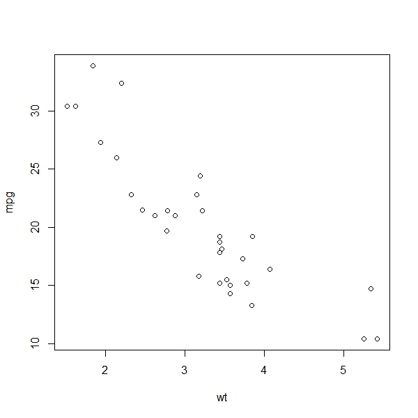
You can see that this plot is somewhat different from the ones we have discussed so far. Many of the plots we have seen so far were histograms, where the scale of the plotted variable lay on the x-axis, and the y-axis showed how often observations were in certain intervals. Alternatively we have seen density functions where distributions are represented. The plot we see here is different. On the x-axis we see the weight and on the y-axis we see the fuel consumption in miles per gallon, and the data is sorted according to weight. This allows us to gain a first impression of the relationship between these two measures, and there is a clear trend: the heavier a car is, the fewer miles it can go per gallon.
The quality of the data is really different here: in many other examples, our observations consisted of a single data point (think of the exam scores in the Basics of Descriptive Statistics for instance). Now, each observation consists of multiple dimensions. This allows us to predict the outcome of one dimension using the information contained in the other dimensions of the observation.
We can express this relationship in numerical terms with the correlation.[2] The correlation is a very general measure of statistical association. It is always a value between -1 and 1. If we have a correlation of around zero, there is no clear relationship between the two variables. If we have a correlation close to 1, the two variables have a strong positive relationship. Let’s look at the correlation between miles per gallon and weight using R’s cor() function:
> cor(mpg, wt)
[1] -0.8676594
With -0.87, we have a value close to -1, which expresses numerically the negative relationship we see in our plot of the two variables.
We can also model this negative relationship between mpg and wt with a trend line, or, more technically, a regression line. To do this, we use the abline() function. This function usually takes an intercept and a slope as an argument. Here, we will generate a linear regression model which approximates the relationship we see in the data. The linear model is, as the name implies, a straight line. We will discuss what goes on in the background below, but let’s first plot the linear model for our data with the lm() function. What we do here is nest the linear model in the abline function:
> abline(lm(mpg~wt))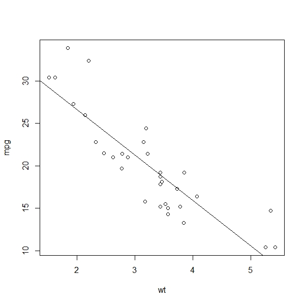
The straight line we generated is the linear regression model which best represents the relationship between the mpg and the wt variables. Unlike the statistical measures we have discussed so far, regression analysis allows us to predict outcomes. We can, for instance, read from the plot above that our model predicts a 3,000-pound car to drive about 22 miles on one gallon of fuel. We can also see that a 4,000-pound car is expected to drive something like 16 miles on a gallon. At the same time, we can observe that the observations are strewn around the regression line. So evidently the model is good but not perfect. Now, before we go on to evaluate how well this linear model fits the data, we discuss how it is calculated.
Ordinary least squares
https://uzh.mediaspace.cast.switch.ch/media/0_ilxrxiv6
Let’s use an abstract model to discuss how our linear model is calculated. In the figure below, you see five blue dots. Each dot corresponds to an observation in a sample. The red line that runs through the graph is the linear model for these five dots. You can think about this in terms of expected values. So how do we calculate the expected values here?
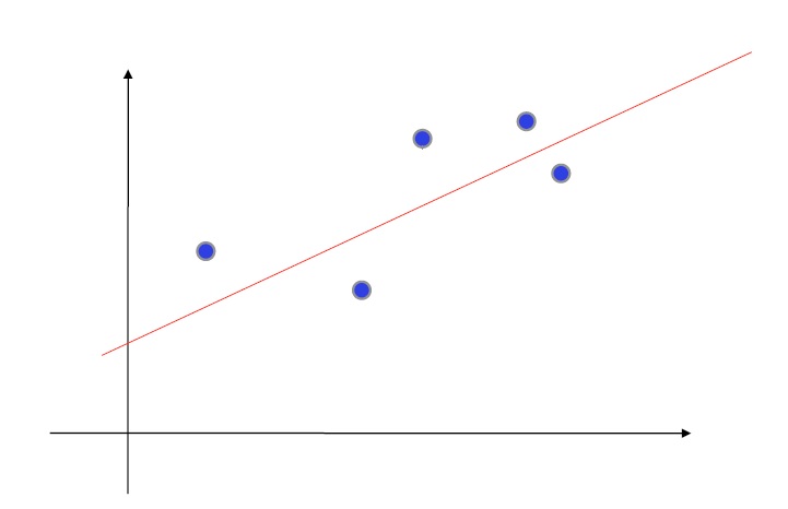
Of course, we want the model to fit the data as much as possible. To do this, we minimize the distance between the model and each observation. We do this by calculating the squared differences between the model and the datapoints. This should ring a bell that chimes of standard deviation and chi-square. What is different here is that we calculate the squared differences under a minimization function. The minimization function is mathematically somewhat advanced, and we won’t go into details about how it works. Suffice it to say that it allows us to minimize the difference between the observed values and the expected values which the model supplies.
The idea of ordinary least squares is to predict an outcome by regressing to the observation, i.e. the independent variable. We minimize the distance between the observed and expected values. The model we calculate this way is literally a line:

Here, a is the ascent that rises or falls as we move along the x-axis, and b is the intercept, which is to say the point at x=0 where our model intersects with the y-axis. This is also why the function we used in R is called abline.
Interpreting the linear model output
https://uzh.mediaspace.cast.switch.ch/media/0_unqwimhf
Obviously, whenever we create any kind of model for a set of observed data, the model only ever approximates the data. This approximation is exactly what we want, since it helps us to get a handle on the data, and allows us to focus on the significant trends instead of the fluctuations of individual observations. However, this only works if the model is good, i.e. captures a real trend. Which begs the question of how we can evaluate the goodness of a model’s fit.
We’ll discuss this at the example of the linear model. First, we assign the linear model from above to new variable, which we call fit:
> fit <- lm(mpg~wt, data=mtcars)Then we can call up the summary of the model using the summary() command:
> summary(fit)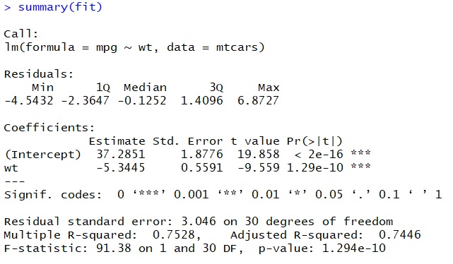
There’s quite a bit to unpack in the output here and we won’t discuss everything, since not everything is equally important at this stage. The first line of the output is useful: it tells us which model the output is for. This comes in really handy when working with multiple models where you forget which model you assigned to which variable (not that this would ever happen to you, we are sure).
The next section of interest is under the heading of ‘Coefficients’. In this two-rowed table, the columns labelled ‘Estimate’ and ‘Pr(>|t|)’ interest us most. Let’s begin with the estimates. We discussed before that the linear model corresponds to a straight line defined by the function . We said that b is the intercept, and indeed one of our rows is labelled intercept. Now if you think about what the regression actually does – predict mpg using the information in wt – you will see that the intercept corresponds to the miles a car can drive on a gallon, if the car weighed zero pounds. With our current engineering capabilities, this is of course pure science fiction.
That’s why we need the coefficient for weight, which is -5.3. This coefficient tells us that with each additional unit of weight (1,000 pounds in this case), the number of miles a car can go on a gallon decreases by 5.3. So, a car weighing 2,000 pounds is predicted to drive  miles per gallon. If we go back and look at the data, we can see that there is one car which weighs roughly as much. The Porsche 914-2, which brings 2,140 pounds to the scale, can drive 26 miles per gallon. It seems that our model, simple as it is with only one independent variable, does a fairly good job at approximating the data by setting a plausible intercept and slope in the two coefficients.
Now, let’s look at the probabilities. There is a column labelled ‘t value’, and the values we see there correspond precisely to the t-values we discussed in the t-test chapter. Remember that when we calculated t-values there, we had to look up a probability value or run the t-test in R to get something we could meaningfully interpret. R spares us this additional effort by printing the probability for the t-values in the column labeled ‘Pr(>|t|)’. That column shows us the likelihood of observing this relationship in randomly distributed data in which the independent variable has no effect. We can see that this probability is very close to zero for both coefficients, which indicates that our model picks up a relationship which is significant at the 99.9% level. This is also what the asterisks after the probability value mean. When we discuss multiple linear regression below, we will see that these probability values help us determine which factors are important for the model.
The final element in this summary output worth mentioning at this stage is the ‘Multiple R-squared’, which is one of the measures for the quality of our model. The R-squared value tells us how much of the variation in the data we can explain with our linear model. It is, by construction, a value between 0 and 1, with an R-squared of 0 meaning that our model does not explain any variation whatsoever, and an R-squared of 1 meaning that our model explains 100% of the variation in the data. The plot corresponding to an R-squared of 1 would show all observations on a perfectly straight line, which is what the linear model is. This is, like the intercept, merely hypothetical, since in any empirical work, the data will not be distributed like that, but will show some level of fluctuation. In our example, we get an R-squared of 0.75, meaning that we can explain 75%, three quarters, of the variation we observe, which is not too shabby for a simple linear model. Accordingly, about 25% of the variation in the data cannot be explained by the model and is thus due to the relationship between mpg and factors other than weight.
Of course, the rationale for these evaluative measures is clear. If we have a model which only poorly fits the data, the trends we observe in the coefficients are next to meaningless. We just saw with the R-squared value that we can explain 75% of the variation in our data. The R-squared is the measure included in the summary output, but, as you might have expected, R provides more means of evaluating the quality of a model.
The one measure we want to discuss here is known as Cook’s distance, which is both useful and intuitive. We can obtain it by plotting the model we named fit and adding the additional argument which=4:
> plot(fit, which=4)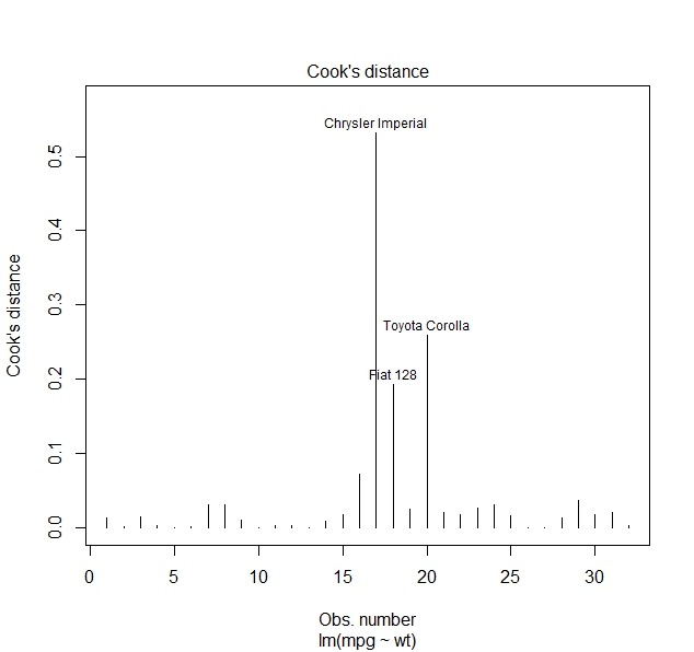
The Cook’s distance tells us by how much individual predictions are off. We see that there are three values which are very far off. Our prediction for the fuel consumption of the Chrysler Imperial is more than 50% off, the prediction for the Toyota Corolla is by almost 30% off and the prediction for the Fiat 128 is off by roughly 20%, while the predictions for the majority of cars is fairly accuracte. If we go look at the data again, we see that the Chrysler Imperial actually consumes relatively little for how heavy it is and the Toyota Corolla, which is light to begin with, consumes even less than our model would lead us to expect. So we see here that while our model isn’t terrible, we are probably missing some factors which have a strong impact on the mpg a car can drive.
Multiple linear regression
https://uzh.mediaspace.cast.switch.ch/media/0_kkfqnb9n
We motivated this chapter with the fact that regression analysis allows us to analyze multiple factors which influence the observations in a dataset. In this section we discuss how to do this.
Let’s begin by turning again to our dataset. If we look at the Ferrari Dino, we see that it weighs 2,770 pounds. If we use our model, we would predict it to run  . However, the Ferrari Dino only manages to do 19.7 miles on a gallon. Now, we may know that it is a sports car or see that it has quite a lot of horsepower and think that we should account for that in our model.
To do this, we have to create a new model. Again, we are going to create a linear model, but this time we are going to include wt, hp and the interaction between the two variables in the model. The interaction is expressed with a colon between the two variables whose interaction we are interested in, so here we write hp:wt. The interaction is a measure for how strongly the two variables are correlated, and depending on the results, this could entail some complexities. Before we get into those in detail, let’s create this multiple linear model:
> fit2 = lm(mpg~wt + hp + wt:hp, data=mtcars)And take a look at the summary:
> summary(fit2)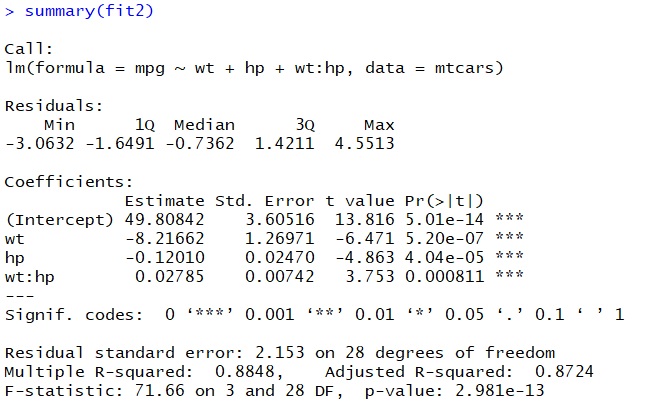
The output is already somewhat familiar, but there are some important differences. First off, we see by the asterisks that all of our explanatory variables are significant at the 99.9% level. This means that weight and horsepower have significant explanatory power for miles per gallon. If we look at the t- and probability values, we see that weight is probably more important than horsepower, but it is clear that both of these factors are strongly relevant to mpg.
The interaction term is also significant. It is a measure for the correlation between horsepower and weight, and this correlation seems to be fairly strong. The result of this is that it is to some degree a coincidence whether the model judges weight or horsepower to have more explanatory power. This means that the ranking we get concerning whether horsepower or weight is the more important factor is not completely reliable. Still, since the t-value of the interaction term is a lot smaller than the t-value of the other explanatory variable, we have good reason to assume that the ranking our model makes is more or less reliable.
We cannot plot the relationships of this multiple linear model since we would need a three-dimensional representation (four dimensional, if we wanted to include the interaction term). Once we go beyond three dimensions it becomes really hard to imagine what these representations should look like, but this is, to some degree, irrelevant since the principle for interpreting the output is exactly the same as with the simple linear regression model. We have an intercept and coefficients which express the relationship between miles per gallon and two explanatory variables. Each additional unit of weight now decreases mpg by 8.2 and each increase in horsepower decreases mpg by 0.12
If we look at the R-squared value, we see that this multiple linear model explains the observed variation far better than our simple linear model. There, we could explain 75% of the variation in the data, now we can explain 89% of the variation in the data. As we would perhaps expect, our model fit has become a lot better by including more explanatory factors.
We can also see the improvement of our model in the Cook’s distance:
> plot(fit2, which=4)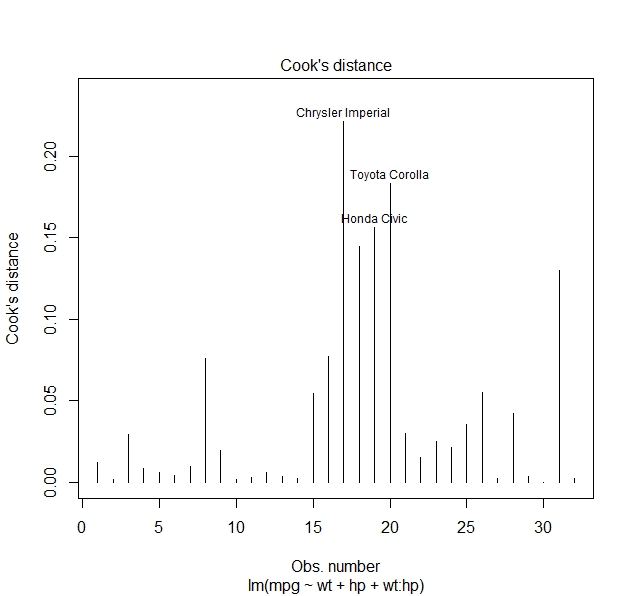
We see that the datapoints which diverge strongly from our predictions now diverge far less than in our simple model. Even though these outliers are partly the same ones, the Chrysler Imperial and the Toyota Corolla, the maximum difference between prediction and observation has decreased from more than 50% to just above 20%. This is further evidence for the fact that this multiple linear model is much more reliable than the simple linear model from the preceding section. If we were to continue working with this dataset, we would certainly choose this multiple linear model.
Exercise
[Exercise to come]
Of course, the fact that we can compare several factors is one of the great affordances of regression analysis. We can now come full circle and return to the question of passive forms in British and American English. With the addition of multiple linear regression, we now have a statistical method in our arsenal with which we could better analyze how geography and genre are related to the use of passive forms. However, we still face a problem: when we investigate passive forms, we are not dealing with a continuous numeric variable, but a nominal one. The quality of the data is fundamentally different from miles per gallon. As a result, we could try analyzing passive forms with a multiple linear model, but the analysis would still be flawed.
In the next chapter we are going address this issue by discussing logistic regression, a type of regression analysis which is particularly suited for categorical data.
References:
Evert, Stefan. 2009. “Rethinking Corpus Frequencies”. Presentation at the ICAME 30 Conference, Lancaster, UK.
Hundt, Marianne, Schneider, Gerold, and Seoane, Elena. 2016. “The use of be-passives in academic Englishes: local versus global language in an international language”. Corpora, 11, 1, 31-63.
Johnson, Daniel Ezra. 2013. “Descriptive statistics”. In Podesva, Robert J. and Devyani Sharma (eds.), Research Methods in Linguistics. Cambridge University Press. 288–315.
Kabacoff, Robert I. 2011. R in Action: Data Analysis and Graphics with R. Manning Publications.
Taavitsainen, Irma and Schneider, Gerold. 2019. “Scholastic argumentation in Early English medical writing and its afterlife: new corpus evidence”. From data to evidence in English language research, 83, 191-221.
