In this part, Language Models, we discuss how statistics can inform the way we model language. To put it very simplistically, language consists of words and of the interaction between words. In this chapter we focus on language at the level of words, and show how we can use the methods discussed in the preceding section can help us to evaluate word frequencies.
The simplest language model: 1-gram
At its simplest, language is just words. Imagine language as an urn filled with slips of paper. On each paper there is one word, and together these words constitute the lexicon of the language. Say the urn contains N words. We draw M word tokens from the urn, replacing them every time. At the end of this exercise, we have a text which is M words long. If this is our language model, what are the assumptions behind it?
Basically, there are two assumptions in this model. The first of these is that every draw is independent. This means that the word you have just drawn has a probability of  of occurring, regardless of what precedes it. Of course, this is not a realistic assumption. In actual language, the first word of a sentence narrows the number of possibilities for the second one, which in turn reduces the number of choices for the third word, and so on and so forth. We will discuss this assumption at greater length in the next chapter.
The second assumption is that every word type is equally likely to be drawn. Since each word has a probability of being drawn, it is equally likely that you will draw “the” and “Theremin”. Again, you are quite right in thinking that, actually, not all words occur with the exact same frequency. What might be less obvious than the observation that different words are used with different frequencies is how frequent different words actually are. How likely, which is to say frequent, are frequent words? How frequent are rare words? How much more frequent are frequent words than rare words? One may also take a sociolinguistic perspective, and ask: who uses how many words? Actually, how many word types are there?
In what follows, you will see how the statistical methods from the last chapters can help to answer some of these questions.
Types, tokens, rare and frequent words
In order to explore the distribution of words in R, we need to load in a large corpus. For this chapter we use the ICE Great Britain. The file is structured as a long list with one word per line. In R terminology, we have a long vector of strings. Download the raw text file here:
[Dataset to come]
Save it so you can find it again and load it into R:
> icegb <- scan(file.choose(),sep="\n", what="raw")We can take a first look at our vector:
> icegb[1:20]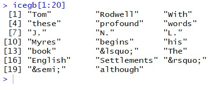
Now, we can restructure the corpus into a frequency table, using the table() command we introduced in earlier:
> ticegb = table(icegb)If you look at the first few entries of the table, it doesn’t look too informative yet. However, we can sort the table by descending frequency to see what the most frequent words are:
> sortticegb = sort(ticegb,decreasing=T)And then take a look at the 100 most frequent words:
> sortticegb[1:100]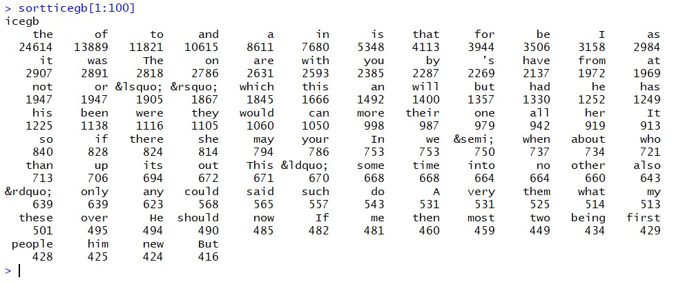
Now, of course, we can begin to visualize the results, to make them more easily interpretable. For instance, we can create a set of histograms:
> hist(as.vector(sortticegb[1:100]),breaks=100)
> hist(as.vector(sortticegb[1:1000]),breaks=1000)
> hist(as.vector(sortticegb[1:10000]),breaks=10000)
[H5P slideshow: histograms]
[H5P: What type of distribution is this?]
We can also check for the number of different types in the ICE GB, using this sequence of commands:
> types = length(as.vector(sortticegb)) ; types
[1] 33816
[H5P: How would you find out the number of tokens in R?]
One obvious question that arises when looking at word frequencies is who uses how many words, or rather who uses how many different types? The measure which is used to evaluate vocabulary richness is known as the type per token ratio (TTR). The TTR is a helpful measure of lexical variety, and can for instance be used to monitor changes in children with vocabulary difficulties. It is calculated by dividing the number of types by the number of tokens in a passage of interest:

Using this formula, we can calculate the TTR of the ICE GB:
> types/tokens
[1] 0.07929615
Usually the TTR is very small, which is why it is often handier to invert the ratio and calculate the tokens per type:

In this formulation, the TTR tells us how often, on average, each type is used. When we refer to the TTR henceforth, we talk about the token per type ratio.
For the ICE GB, we would then calculate:
> TTR = tokens / types ; TTR
[1] 12.61095
This value indicates that, on average, each type occurs 12.6 times in the ICE GB .
As soon as we start to think more about this metric, we can see that it depends fundamentally on the sample size. The paragraph in which we introduce the TTR above – starting with “One obvious” and ending with “passage of interest” – consists of 82 tokens and 59 types. Accordingly, its TTR is  . In this paragraph, each type occurs 1.39 times on average. Now, let us look at a very short sentence. For instance the preceding one. The TTR for “now let us look at a very short sentence” is 1, because every token is of a unique type. This means that when we compare different samples with each other, as we do below, we want to take samples of a comparable size.
Exercise: TTR
You can try this yourself now. You may wonder whether written language has a richer vocabulary than spoken language, as measured by TTR.
[H5P: What is the null hypothesis to formulate here?]
[H5P: Calculate the TTR for the first 10’000 words of the ICE GB written, which we used above.]
Now, download the ICE GB spoken from here:
[icegb_spoken.words]
Then, load it into R.
[H5P: Calculate the TTR for the first 10’000 words of the ICE GB spoken]
You can see that there is a pronounced difference between the spoken and written parts of the ICE GB corpus.
[H5P: Which significance test would you use to check whether the difference is statistically significant?]
With this basic principle, you have a solid basis for comparing the vocabulary richness of different genres, dialects or speakers. However, when it comes to producing fully fledged research, simply taking the first 10’000 words of two corpora is generally not advisable since the sequence of documents in a corpus can potentially skew the results. Instead, we recommend forming segments of equal length, for instance 2,000 words, calculating the TTR for each segment and then comparing the mean.
Zipf’s law
Another interesting aspect of word frequencies in corpora is known as Zipf’s law. Named after the Harvard linguistics professor George Kingsley Zipf (1902-1950), it explains the type of distribution that we get when counting the word tokens in a large corpus. Zipf’s law states that in a sorted frequency list of words the measure  is nearly constant. In other words, there is an inversely proportional relationship between the rank of the type and the number of tokens this type contributes to the corpus.
We already sorted the written ICE GB corpus according to frequency above, so let’s investigate how well Zipf’s law holds up here. Remember that to view the contents of a table, we can use square brackets:
> sortticegb[1]
the
24614
To only retrieve the frequency in a table like this, we can use two square brackets:
> sortticegb[[1]]
[1] 24614
For the first ranked entry, this is of course already the value we need to test Zipf’s law (because the frequency multiplied by 1 is equal to the frequency). For the remaining ranks, we can formulate a sequence of commands which calculates the rank*frequency:
> myrow = 3; freq = sortticegb[[myrow]] ; zipfconstant = freq * myrow ; zipfconstant
[1] 35463
By scrolling back up in the history in the R console, we can quickly generate a small sample of these values:
> myrow = 5; freq = sortticegb[[myrow]] ; zipfconstant = freq * myrow ; zipfconstant
[1] 43055
> myrow = 10; freq = sortticegb[[myrow]] ; zipfconstant = freq * myrow ; zipfconstant
[1] 35060
> myrow = 20; freq = sortticegb[[myrow]] ; zipfconstant = freq * myrow ; zipfconstant
[1] 45740
There is a lot of variance here, but five values are clearly not enough for us to draw any conclusions yet. Say we want to see whether Zipf’s law holds up over the 30, or 100, most frequent words. Instead of assigning values from 1 to 30 (or 100) manually, we can tell R to go through each of them, using a loop. Remember that loops work exactly like the indexes in mathematical sums (if not, you might want to take a quick look at the Introduction to R again, where we discuss this for the first time).
In the loop, we first give the value 1 to the index variable i, then 2, and so on until we reach the last value of interest, 30 in this case. We save the results in the list variable titled zipfconstant, which we again index with i:
> for (i in 1:30) { freq = sortticegb[[i]] ; zipfconstant[i] = freq * i}
> zipfconstant
 [1] 24614 27778 35463 42460 43055 46080 37436 32904 35496 35060 34738
     35808   37791 40474 42270 44576 44727 46674 45315 45740 47649 47014
[23] 45356 47256 48675 50622 51435 52276 53505 49980
Now we have a vector, zipfconstant, which contains the Zipf contstant for the thirty most frequent words in the ICE GB. Even though these are only thirty values, it is rather hard to intuit anything about how constant they are, especially because the values are all very large. It might be easier to see patterns if we plot the values of a larger sample:
> for (i in 1:100) { freq = sortticegb[[i]] ; zipfconstant[i] = freq * i}
> plot(zipfconstant)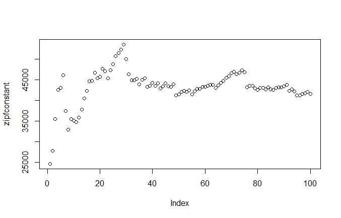
How can we interpret this? The plot shows us that there is a lot of variance in the Zipf constant of the highest-ranking words. This makes a lot sense, when we consider that the difference between these frequencies vary strongly. Let us calculate the Zipf constant for the five most frequent words:
- 24614*1 = 24614
- 13889*2 = 27778
- 11821*3 = 35463
- 10615*4 = 42460
- 8611*5 = 43055
There are large jumps in the frequencies, which cause a lot of variation in the Zipf constant. However, this is only true for the first thirty or so values. After those, we see a strong regularity, with the Zipf constant ascending steeply. This indicates that, for the highest ranking values, the increase in rank outweighs the decrease in frequency. Then, the constant begins to earn it’s name.
Let’s see what happens when we extend the analysis further:
> for (i in 1:1000) { freq = sortticegb[[i]] ; zipfconstant[i] = freq * i}
> plot(zipfconstant)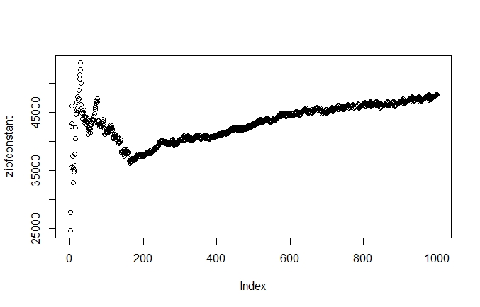
When we look at the Zipf constant for the 1,000 most frequent words, we see a similar pattern. We retain the high variance in the highest ranking words, and then see a more stable pattern, a mild upwards trend, starting at around 180 on the index axis. However, the regular pattern we saw starting at around 30 in graph 7.3 looks a lot wilder here. What’s going on here? Well, we compress the y-axis by a factor of ten, i.e. we fit ten times more observations on the y-axis, but the x-axis stays the same. So the variance, the vertical fluctuation, stays within the same range but is compressed horizontally. Accordingly, it looks as though the fluctuations are more intense when we plot more observations in a graph of the same size.
Let’s see what happens when we plot the Zipf constant for the entire ICE GB corpus. To do this, we can let our loop run through the length of the corpus:
> for (i in 1:length(sortticegb)) { freq = sortticegb[[i]] ; zipfconstant[i] = freq * i}
> plot(zipfconstant)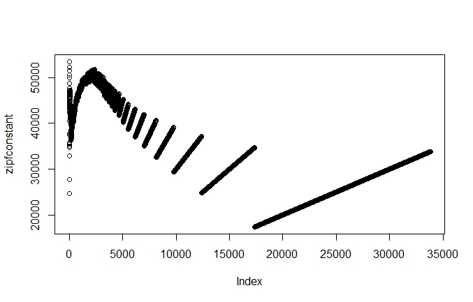
If we create a histogram of the Zipf constant, we get a slightly different idea of how regularly the Zipf constant is. We set the parameters for the histogram so that the y-axis shows the Zipf constants between 10,000 and 60,000 and that there are 100 breaks in the histogram:
> hist(zipfconstant,xlim=c(20000,60000),breaks=100)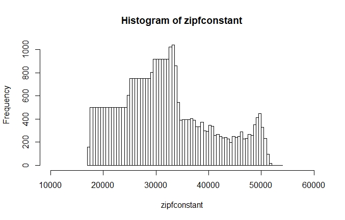
The histogram shows us that most of the Zipf constants in the ICE GB are concentrated on the left side of the peak, which is at around 33,000. On the right side, we have fewer values but a somewhat longer tail. While neither the histogram nor the plot show the Zipf constant to be as consistent as the name implies, both the plot and the histogram clearly show is that there are certain regularities regarding the relation of rank and frequency. The regularities of word frequencies can help us to think about how language is structured.
Exercise: Test your intuition
Remember that we can access a table column in R by its position:
> sortticegb[2]
   of
13889
We can also access it by the name of the row:
> sortticegb['of']
   of
13889
Now, compare for a few words if they are more frequent in written or in spoken language. You should already have the ICE GB spoken loaded into R from the TTR exercise above.
Process it into a sorted frequency table like we did with the ICE GB written earlier in the chapter. Do not forget to correct (at least roughly) for the fact that the spoken part of the ICE GB is bigger than the written part. For the correction, you can either cut the corpora into segments of equal lengths, taking for example the first 100’000 words, or you can extrapolate from the frequencies you have in the written corpus and multiple them by 1.2, which is roughly equivalent to the difference in size between the two corpora.
Once you have both corpora available in this form, you can begin comparing word frequencies in spoken and written language. You can do so either by looking at the raw numbers, or more elegantly by writing a sequence of commands which results in a ratio:
> myrow = 'daresay' ; factor[myrow] = ((sortticegb[[myrow]] * 1.2)/ sortticegbspoken[[myrow]]) ; factor[myrow]
daresay
   0.6
Applications
Although word frequencies are clearly a simple way of using statistics in linguistics, they can lead to insightful (and entertaining) analyses. For instance, Rayson et al. (1997) use word frequencies and chi-square tests in combination with sociolinguistic characteristics to investigate social differentiation in the use of English. The paper is more intent on delivering a proof of concept than on making any grand statements about how different speaker groups use language, but it is still interesting to note, for instance, that younger speakers do not only show “a marked tendency in favour of certain taboo words” but also a “stronger tendency to use the polite words” (Rayson et al. 1997: 140). We can recommend reading Rayson et al. (1997) for an impression of how word frequencies can be used in original research.
After this discussion of 1-grams and frequencies, we turn to more complex and elaborate language models in the next chapter, N-grams.
Reference:
Rayson, Paul and Leech, Geoffrey and Hodges, Mary. 1997. Social differentiation in the use of English vocabulary: some analyses of the conversational component of the British National Corpus. International Journal of Corpus Linguistics, 2.1, 133–152.
