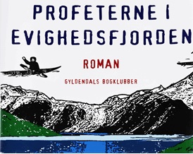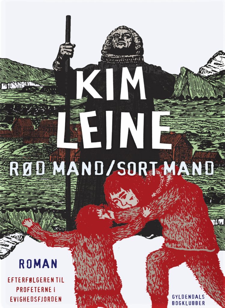
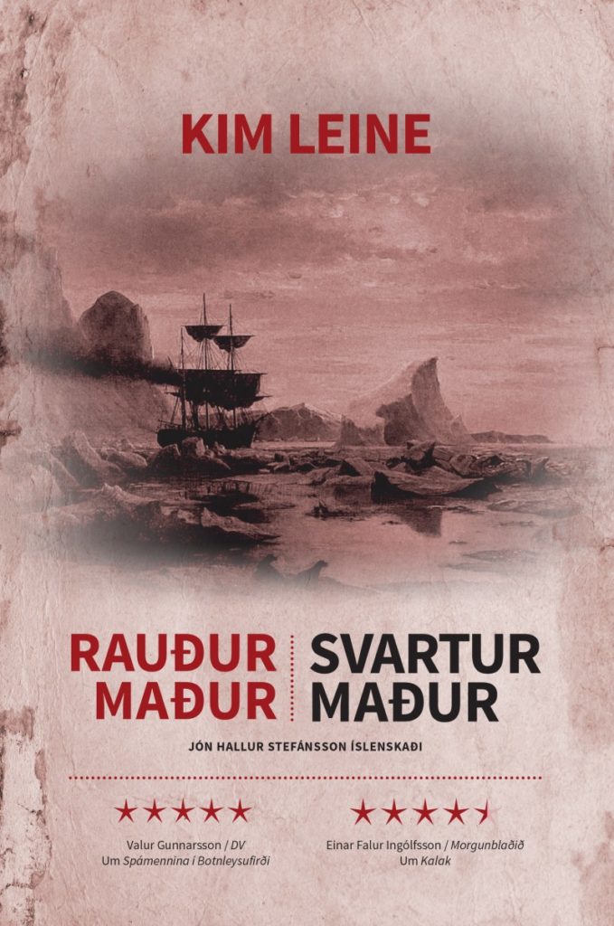
Danish front cover:
Rød mand/Sort mand – even if you do not understand the meaning of the Danish book title by Kim Leine you will be able to guess its meaning easily, simply by looking at its cover. Yes, you are right – it means “red man/black man”. So, what else does the book cover tell us? By analysing the book title, we find on the one hand equality in the term man and on the other hand inequality in the accompanying attributes red and black. In the visual part of the book cover the otherness of the black and the red man [1] is clearly marked by the two colours – not only their clothes but their whole bodies take the two colours on. But do the two colours red and black really imply differentness? The black man is wearing a black robe with a ruff, like protestant priests do (Pastoureau 126). Also the colour red relates to the church even if the red man is wearing indigenous pagan clothing probably made from sealskin. Red is the colour worn by Catholic priests particularly on Whitsuntide in memory of the shed blood of Jesus Christ (36). If we continue to analyse the meaning of the two colours by their usage in a religious context, we can not ignore that the colour red is linked to the devil. However, the same was true in old days for the colour black (45-51). So, there is to state that both colours and consequently both men can stand for the same, but they somehow can never be the same because it is impossible for them to get rid of their own colour.
The usage of the backslash in the title points in the same direction. Backslashes are used to mark connections between the words they are set between. A connection in the sense that terms which are separated by a backslash can be used alternatively – so the words have something in common but aren’t exactly the same (Duden n.pg.).
Let us now check the placement of the male figures in the title. Here we have a horizontal confrontation and the red man receives the advantage to stand in front. If we take a look at the visual part, we can recognize a vertical confrontation, here the black man is on top and the red man is at his feet. By combining these two observations it is to state that they compensate each other because both men get the chance to stay in front.
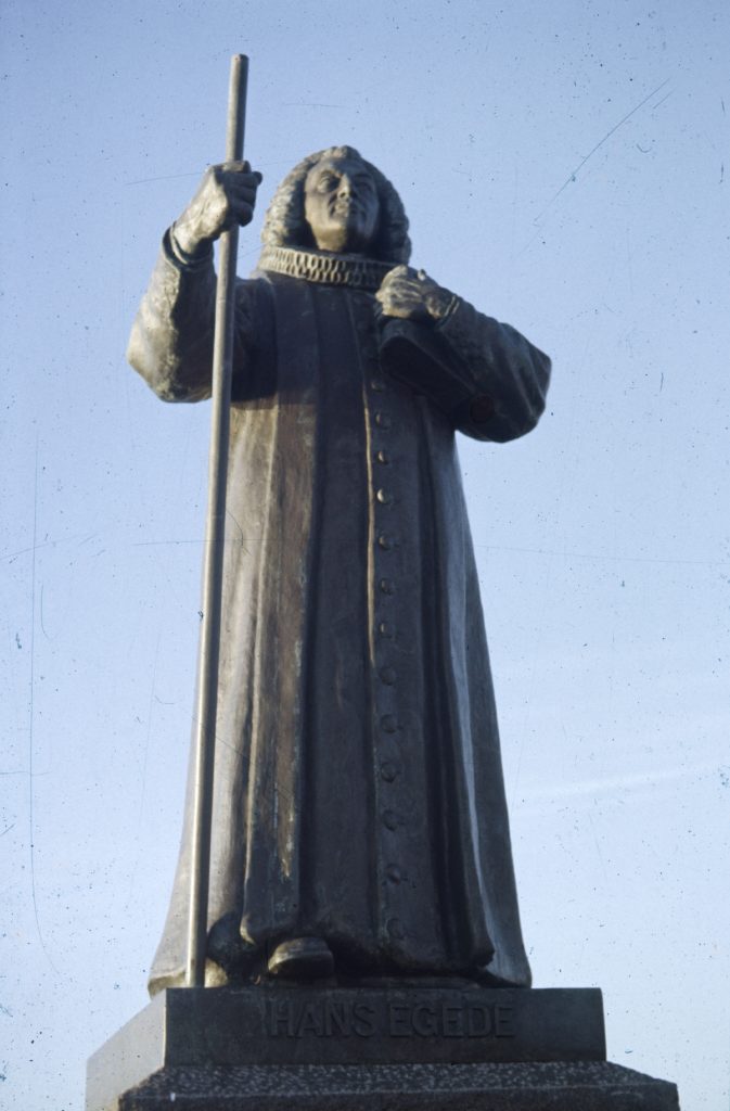
Let us now go into more detail by analysing the background of the book cover. The man clothed in black has in his back an uneven landscape coloured by the majority in green. There are just a few spots covered in white – likely growlers or snow topped mountains. In addition, there is a small settlement of houses strangely coloured in red. Therefore, it can be remarked that the reddish coloured houses make the red man somehow part of the black man’s background. Anyone who knows a thing or two about old Scandinavian saga literature may already have noticed the connection between the described green and white sprinkled landscape illustrated in the front cover’s background and Eiríks saga rauða. There we read about the settler Eiríkr rauður: «Þat sumar fór Eiríkr at byggja land þat, er hann hafði fundit ok hann kallaði Grœnland, því at hann kvað menn þat mjǫk mundu fýsa þangat, ef landit héti vel.» (Eiríks saga rauða 201). Translation: «In the summer Eirik went to live in the land which he had discovered, and which he called Greenland, ‘Because,’ said he, ‘men will desire much the more to go there if the land has a good name’.» (Sephton n.pag.). The settler wily attributed Greenland to be mostly green. With Eiríkr rauður, whose byname rauður means the Red, a man with a connection to the colour red is made part of the black man’s background once more. The figures of the red man and the black man are overlapping each other. Nonetheless, there is a transformation in the background when we look at the illustration of the red man. His background is purely white – probably referring to ice and snow. The same white is detectable in the representation of the sky above the black man. Thus, also the black man is part of the red man’s background. Furthermore, a text linked to Greenland which pictures the country entirely white in contrast to Eiríks saga rauða can be found. The Greenlandic missionary Hans Egede wrote in his diary, when he was able to see Greenland’s land tongue from their ship, on the 4th of June 1721: «Dette land kom os ret fælt fore. Saasom det syntes at være gandske overtækt med Jis og Snee […]» (Egede 28). Translation (by the author of this article): «This land appeared horrible. It seemed to be pretty covered with ice and snow». With the connection between this text and the front cover illustration it is easy to identify the illustration of the black man as the historical person Hans Egede. Hans Povelsen Egede was a Danish-Norwegian priest who lived from 1686–1758. According to his wish, he was appointed to be the first missionary in Greenland. There he founded Nuuk in 1728 (Mølholm Olesen n.pag.). It is in the city of Nuuk where, up to the present day, a statue of Hans Egede can be found. Apparently it was the model for the visualization of the front cover’s black man.
Knowing that both backgrounds on the front cover illustrate Greenland and the black man represents Hans Egede, we have a clear reference to the colonial history of Denmark and Greenland. There it can be said that Hans Egede as the black man serves as a personification of Denmark and the red man as a personification of Greenland.
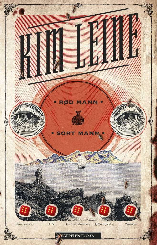
Norwegian and Icelandic front cover:
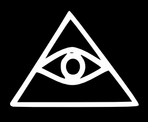
We are moving on to the Norwegian front cover and starting again with the title. The Danish title has been translated into Norwegian word by word – «Rød mann/Sort mann» – although on the Norwegian front cover it is written without backslash («Kim Leine. Bibliografi» n.pag.). Instead of a backslash, dots are used to mark the beginning and the ending of each part separately. Both terms seem less connected than the ones we have seen on the Danish front cover. Once again, like on the Danish front cover, we have a horizontal and a vertical confrontation of the red and the black man illustrated on the front cover. This time the vertical confrontation is the one of the written title. Here we have the red man above the black man. The horizontal confrontation is represented by a pair of black eyes bordering a red circle which has a figure in its centre. To approach a decoding of these illustrations, the religious associations linked to the colours red and black help, as we have already seen in the analysis of the Danish cover. The stand-alone eyes resemble the Eye of Providence/Eye of God while the figure in the red circle with broken horns breastfeeding a child recalls the symbol of the Baphomet – an occult demon. For comparison see the following pictures.
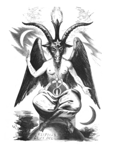
On the right: Baphomet (Lévi, Éliphas : Dogme et Rituel de la Haute Magie. Volume 2, Germer Baillière, 1856)
This corresponds to the Danish version where the black man was connected to the church and the red man to Satan. We can suppose that the Eyes of God stand for the black man and the Baphomet for the red man, hence the black man surrounds the red man. Here we are not given a background for comparison, but the eyes of the black man are encircled red and the icon of the Baphomet is bordered black. All taken together there is once again no figure standing out.
Additional to what was visualised on the Danish cover, the Norwegian cover shows a „discover“ motif. On the „discover“ motif we can see two coasts (one illustrated in dark, the other one in bright colours), the stern of a sailing ship which sails towards the bright coast and an Inuit recognizable by his cloth standing on the dark coast. There are two approaches to interpreting this scene. The first one would be that the dark coast, like the black eyes and the black man, stands for Denmark and the brighter coast shimmering slightly green, like what we have seen in the Danish cover, could be interpreted as Greenland. In the end, we have an exchange: the Inuit on the land of the Danish settlers and the Danish settlers on their way towards the land of the Inuit people. In the book’s prologue it is mentioned that the red man can travel anywhere he wants, which would support this interpretation (Leine 11). The second approach of interpretation is based on the assumption that the Inuit is situated in his homeland, while the Danes on their sailing ship are leaving Greenland towards a new land represented by the bright coast. Bright as a symbol of a new beginning like the sun rising in the morning (Pastoureau 35). That would mean that the Inuit people are winning over the Danish colonists who leave their land. But the beetles that stroll around the whole cover illustration could relativize the victory of the Greenlanders. In the Bible, vermin are sent to Egypt as one of the ten plagues (Luther 2 Mos 17). Accordingly, the vermin illustrated on the front cover could be understood as a symbol for the evil that the Danes left behind on the Island.
Anyway, it can be stated that the Norwegian cover visualisation, compared to the Danish one, remains less specific. The Norwegian front cover can not be interconnected with the Danish-Greenlandic colonial history as easy as the Danish one because the Norwegian cover abstains from representing real historical people who can be immediately connected to the colonial times. The same manner of unspecific illustrations continues on the front cover of the Icelandic translation Rauður maður/Svartur maður. The Icelandic front cover abstains completely from visualising the black and the red man and uses only, like the Norwegian cover, a „discover“ motif. References to the Danish-Greenlandic colonial history disappear entirely.
Observations in short
In the first place, we see that direct colonial references to historical figures are only used in the Danish front cover. All other Scandinavian cover versions use less specific visualisations.
Secondly, on all the front covers analysed in this blog, there is no clear sign of a colonial power structure in which one side stands above the other. Rather the colonist and the colonized personified and represented in the black and the red man are somehow blended into a hybrid form that does not allow supremacy.
References
Duden. «Schrägstrich: D 156.» duden.de. Web. 06.12.2020.
Egede, Hans: Omstaendelig og udførlig Relation, Angaaende den Grønlandske Missions Begyndelse og Fortsaelttelse samt hvad ellers mere der ved Landets Recognoscering, dets Beskaffenhed, og Indbyggernes Vaesen og Leve-Maade vedkommende, er befunden. Kopenhagen: Trykt hos Joh. Christ. Groth, 1738.
Eiríks saga rauða. Hg. von Einar Ól. sveinsdon und Matthías Þórðarson. Íslensk Fornrit 4. Reykjavík: Hið íslenska fornritafélag, 1935, 193-237.
Cappelen Damm. «Kim Leine. Bibliografi» cappelendamm.no. Web. 20.11.2020.
Leine, Kim: Rød mand/Sort mand. Kopenhagen: Gyldendal, 2018.
Luther, Martin: Lutherbibel. Revidiert 2017. Stuttgart: Deutsche Bibelgesellschaft, 2016.
Mølholm Olesen, Simon. «Hans Egede, 1686-1758.» danmarkshistorien.dk. Web. 19.11.2020.
Pastoureau, Michel, and Lamerz-Beckschäfer, Birgit. Schwarz: Geschichte Einer Farbe. Darmstadt: Verlag Philipp Von Zabern in Wissenschaftliche Buchgesellschaft, 2016.
Sephton, John: Eirik the Red’s Saga: A translation. Marples: Liverpool, 1880.
[1] On the front cover two red people are pictured. The taller man on the right hand side represents the red man mentioned in the title and thus is meant when the term red man is used in this blog. The smaller one on the left hand side, as one gets to know in the book’s prologue, is the son of the man on the right hand side.